Spotify songs
Aurelien Ginolhac
2021-06
Objective: explore songs using the Spotify API
Those kind of questions are optional
More than 30k Spotify songs
This dataset comes from the project TidyTuesday where each week a contributor submit a dataset that participants can explore and analyze. Of course, this dataset was obtained from public access but transformed to meet the tidy principles. Here, we are looking at the Spotify dataset.
Loading data from TidyTuesday
The already pre-processed dataset can be directly obtained here
Tip
Assign the csv file to an object named spotify_songs
First counting
How many songs are present?
How many songs per genre are present?
How many songs do one album contain?
Plot the density of the previous counting per genre
Tip
- a density of the an univariate visualization of the distribution of a numerical value. It is a curve which the area under it sum to 1. The associate geometry is
geom_density()and only one mapped aesthetics is needed (since univariate), so usegeom_density(aes(x = n))once you have computed the number of songs per album. - by default, the density is not filled, I personally like
fill = "grey", alpha = 0.5to have the feeling of the density with some transparency. - for the genre, you have 2 choices, either you color the densities by it or you facet by it.
Warning
- we have a LOT of albums with less than 3 songs in a album, a suggestion is to filter them out
- even after min 3 songs, the distribution will skewed by a few large values. You can use
scale_x_log10()andannotation_logticks(sides = "b")to better visualize the values and distribution.
Songs key
Even if you don’t know much about music, you know that most songs are written in one key associated to a mode, such as B minor. In the columns key and mode, spotify encoded those information following those correspondences.
Create a barplot that display the counts of keys, filled by the mode (minor/major).
Optionally, one could add the percentages of the mode inside the bars.
Tip
the plot will look nicer if:
- discard key / mode with no informative values assigned
- keys are on the y-axis, counts on the x-axis
- key are sorted by their occurrences, like the highest count on top. See the function
fct_reorder()for that matter - the
recode()can help you to get the true note instead of the numerical encoding. See below an example:
mtcars %>%
  mutate(transmission = recode(am, `0` = "automatic",
                                   `1` = "manual")) %>%
  ggplot(aes(y = transmission)) +
  geom_bar()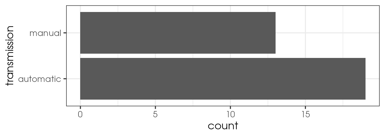
Tracking the ‘spotify’ effect in rap songs
It was suggested that the arrival of streaming services has changed the way artists are working. Especially, the length of tracks in rap music. Since we have the data, we can check this assumption.
Plot the length of tracks for the genre rap in function of the track album release date.
Tip
- add a vertical line (
geom_vline()) to highlight the starts of for example 1 million Spotify users. - you will face over-plotting, one quick way to solve it is to reduce transparency (
alpha). But a recent packageggpoindensityproposes a neat solution. - add a trend line with for example
geom_smooth(method = "loess") - release dates should be converted to a date to get a good x-axis labelling. Use
as.Date(track_album_release_date)to coerce characters to R dates.
Do you see an effect? Do you observe it for other genres?
Songs characteristics
In the same page, Spotify data scientists created several parameters, like valence, speechiness or energy and assigned a score to each song. Let’s explore those parameters and compare the distribution to for example one of my playlist. You can of course use your own playlist if you wish, I can help you with fetching your data.
- Let’s define the columns we want to keep and compare
col_to_keep <- c("track_name", "track_artist", "track_popularity", "track_album_name",
 "track_album_release_date", "danceability", "speechiness", "acousticness",
 "instrumentalness", "liveness", "valence", "tempo", "duration_ms")
Subset only the above columns from the spotify_songs tibble. Assign it to the name sub_spotify_songs
Comparing to another dataset
Extract your own song features
If you wish to extract the song features, to compare with the 33k songs above, the Spotify data you can download don’t contain those. However, you can track the number of plays etc, also a nice project to explore those.
To get the features, we need to use the Spotifyr package. You need to get your client ids and secret, follow the docs on the website.
Here is the code I used once those info obtained:
# package not on CRAN
# remotes::install_github("charlie86/spotifyr")
library(spotifyr)
Sys.setenv(SPOTIFY_CLIENT_ID = 'xxxxxxxxxxxxxxxxxxxxxxxxxx')
Sys.setenv(SPOTIFY_CLIENT_SECRET = 'xxxxxxxxxxxxxxxxxxxxxxxxxxxxxxx')

access_token <- get_spotify_access_token()
my_plists <- get_my_playlists()
# I used only one playlist, get the id of yours
ginolhac <- get_playlist_audio_features(playlist_uris = "xxxxxxxxxxxxxxxx")
filter(ginolhac, !is_local) %>%
  select(track_id = track.id, track_name = track.name, track_album_name = track.album.name,
         track_popularity = track.popularity, danceability,
        key = key_mode, loudness:tempo, duration_ms = track.duration_ms) %>%
  vroom::vroom_write("data/yourname_spotify.tsv.gz")
Load my own Spotify songs from a playlist, from this compressed tsv file. Save as spogino
Tip
Merge the two datasets: spotify_songs and spogino, assign the name spomerge
Warning
inner_join()) tables. But then all columns would be bind, and even if renamed meaningfully, it won’t be tidy. A smarter way of doing this, would be add an id column to each tibble before binding the rows. This will be working, only because ALL columns exist in both tables and are named the same.
# see this toy example
(t1 <- tibble(id = 1,
              a = 1:3,
              b = c("a", "a", "a")))
## # A tibble: 3 x 3
## id a b
## <dbl> <int> <chr>
## 1 1 1 a
## 2 1 2 a
## 3 1 3 a(t2 <- tibble(id = 2,
a = 4:6,
b = c("b", "b", "b")))## # A tibble: 3 x 3
## id a b
## <dbl> <int> <chr>
## 1 2 4 b
## 2 2 5 b
## 3 2 6 bbind_rows(t1, t2)## # A tibble: 6 x 3
## id a b
## <dbl> <int> <chr>
## 1 1 1 a
## 2 1 2 a
## 3 1 3 a
## 4 2 4 b
## 5 2 5 b
## 6 2 6 bPlot the densities of the different parameters, filling it by id
Tip
- this requires to get the parameters in a tidy longer format. to ease pivoting, you should keep only the necessary columns first. I advice you to use these parameters:
c("danceability", "speechiness", "acousticness", "duration_ms", "track_popularity", "liveness", "valence", "tempo") - faceting by parameters is the easiest, mind to use free scaling with
scales = "free"as we have very different distributions.