# install.packages("gapminder")
library(gapminder)

gapminder |>
  ggplot(aes(x = year,
             y = lifeExp,
             group = country)) +
  geom_line()
gapminder and tidyverse packages by running the setup chunk|> to pass gapminder to ggplot()life expectency (lifeExp in y) ~ year (x)geom_line()Mind the grouping!
# install.packages("gapminder")
library(gapminder)
gapminder |>
ggplot(aes(x = year,
y = lifeExp,
group = country)) +
geom_line()
by_countrymodel with linear regressions of lifeExp on year1950by_country_lmdata column.lifeExp ~ year1950 for Bulgaria by unnesting datafilter() for the desired countryunnest() raw dataggplot()summary for the linear model of Rwandafilter() for the desired countrylist() to run summary() on the linear model"r.squared", use the pluck(sumary, "r.squared"), purrr syntaxby_country |>
filter(country == "Bulgaria") |>
unnest(data) |>
ggplot(aes(x = year1950, y = lifeExp)) +
geom_line() 
broombroom is loadedby_country_lm, add 4 new columns:
glance, using the broom function on the model columntidy, using the broom function on the model columnaugment, using the broom function on the model columnrsq from the glance columnmodelslist() when dealing with a list column rowwise groupedcountry ~ rsqrsq): snake plotcountry:forcats packagefct_reorder(country, rsq) to reorder based on the rsq continuous variablelibrary(forcats)
models |>
ggplot(aes(x = rsq,
y = fct_reorder(country,
rsq))) +
geom_point(aes(colour = continent),
alpha = 0.8, size = 3) +
theme_classic(18) +
theme(axis.text.y = element_blank(),
axis.ticks.y = element_blank(),
legend.position = c(0.25, 0.75)) +
guides(color = guide_legend(
override.aes = list(alpha = 1))) +
labs(x = expression(R^2),
y = "Country",
color = "Contient") +
scale_color_manual(values = continent_colors) Warning: A numeric `legend.position` argument in `theme()` was deprecated in ggplot2
3.5.0.
ℹ Please use the `legend.position.inside` argument of `theme()` instead.
unnest column datalifeExp ~ year with linesungroup() as we work currently by row.slice_min(col, n = 5) returns the 5 minimal values of colmodels |>
ungroup() |>
slice_min(rsq, n = 20) |>
unnest(data) |>
ggplot(aes(x = year, y = lifeExp)) +
geom_line(aes(colour = country)) +
facet_wrap(vars(country), nrow = 4) +
theme(legend.position = "none") +
labs(x = NULL,
y = NULL,
title = "Life Expectancy development by country") +
guides(x = guide_axis(n.dodge = 2)) +
scale_color_manual(values = country_colors) 
models |>
  ungroup() |>
  slice_max(rsq, n = 20) |>
  unnest(data) |>
  ggplot(aes(x = year, y = lifeExp)) +
  geom_line(aes(colour = country)) +
  facet_wrap(vars(country), nrow = 4) +
  theme(legend.position = "none") +
  labs(x = NULL,
       y = NULL,
       title  = "Life Expectancy development by country") +
  guides(x = guide_axis(n.dodge = 2)) +
scale_color_manual(values = country_colors) 
tidy column)
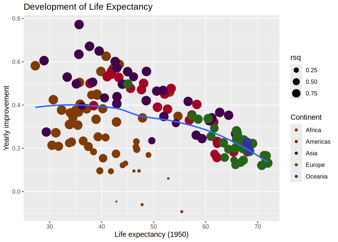
continent, country and rsq columnsslope ~ intercept (watch out the (Intercept) name which needs to be called between backticks!scale_size_area() for readability)geom_smooth(method = "loess")gapminder |>
mutate(year1950 = year - 1950) |>
nest_by(continent, country) |>
mutate(model = list(lm(lifeExp ~ year1950,
data = data)),
glance = list(glance(model)),
tidy = list(tidy(model)),
rsq = pluck(glance, "r.squared")) |>
unnest(tidy) |>
select(continent, country, rsq, term, estimate) |>
pivot_wider(names_from = term,
values_from = estimate) |>
ggplot(aes(x = `(Intercept)`, y = year1950)) +
geom_point(aes(colour = continent,
size = rsq)) +
geom_smooth(se = FALSE,
method = "loess",
formula = "y ~ x") +
scale_size_area() +
labs(title = "Development of Life Expectancy",
x = "Life expectancy (1950)",
y = "Yearly improvement",
colour = "Continent") +
scale_colour_manual(values = continent_colors)