# install.packages("palmerpenguins")Plotting
Note
This practical aims at performing exploratory plots and how-to build layer by layer to be familiar with the grammar of graphics. In the last part, an optional exercise will focus on plotting genome-wide CNV.
![]()
Scatter plots of penguins
The penguins dataset is provided by the palmerpenguins R package. As for every function, most data-sets shipped with a package contain also a useful help page (?).
If not done already, install the package palmerpenguins and load it.
Plot the body mass on the y axis and the bill length on the x axis.
Solution
penguins |>
  ggplot(aes(x = bill_length_mm,
             y = body_mass_g)) +
  geom_point()
Warning: Removed 2 rows containing missing values or values outside the scale range
(`geom_point()`).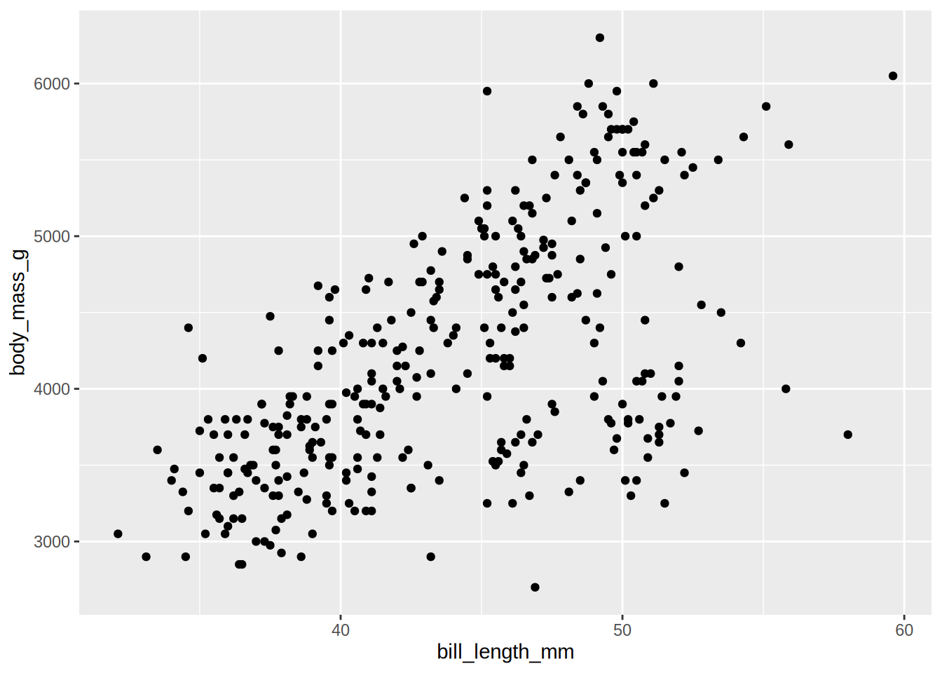
Plot again the body mass on the y axis and the bill length on the x axis, but with colour by species
Solution
penguins |>
  ggplot(aes(x = bill_length_mm,
             y = body_mass_g,
             colour = species)) +
  geom_point()
Warning: Removed 2 rows containing missing values or values outside the scale range
(`geom_point()`).
The geom_smooth() layer can be used to add a trend line. Try to overlay it to your scatter plot.
Tip
geom_smooth is using a loess regression by default for < 1,000 points and adds standard error intervals.
- The
methodargument can be used to change the regression to a linear one:method = "lm" - to disable the ribbon of standard errors, set
se = FALSE
Be careful where the aesthetics are located, so the trend linear lines are also colored per species.
Solution
penguins |>
  ggplot(aes(x = bill_length_mm,
             y = body_mass_g,
             colour = species)) +
  geom_point() +
  geom_smooth(method = "lm", se = FALSE)
`geom_smooth()` using formula = 'y ~ x'Warning: Removed 2 rows containing non-finite outside the scale range
(`stat_smooth()`).Warning: Removed 2 rows containing missing values or values outside the scale range
(`geom_point()`).
Adjust the aesthetics of point in order to
- The
shapemap to the originatedisland - A fixed size of
3 - A transparency of 40%
Tip
You should still have only 3 coloured linear trend lines. Otherwise check to which layer your are adding the aesthetic shape. Remember that fixed parameters are to be defined outside aes()
Solution
penguins |>
  ggplot(aes(x = bill_length_mm, y = body_mass_g,
             colour = species)) +
  geom_point(aes(shape = island), size = 3, alpha = 0.6) +
  geom_smooth(method = "lm", se = FALSE)
`geom_smooth()` using formula = 'y ~ x'Warning: Removed 2 rows containing non-finite outside the scale range
(`stat_smooth()`).Warning: Removed 2 rows containing missing values or values outside the scale range
(`geom_point()`).
Ajust the colour aesthetic to the ggplot() call to propagate it to both point and regression line.
Try the scale colour viridis for discrete scale (scale_colour_viridis_d()). Try to change the default theme to theme_bw()
Solution
penguins |>
  ggplot(aes(x = bill_length_mm, y = body_mass_g,
             colour = species)) +
  geom_point(aes(shape = island), size = 3, alpha = 0.6) +
  geom_smooth(method = "lm", se = FALSE) +
  scale_colour_viridis_d() +
  theme_bw()
`geom_smooth()` using formula = 'y ~ x'Warning: Removed 2 rows containing non-finite outside the scale range
(`stat_smooth()`).Warning: Removed 2 rows containing missing values or values outside the scale range
(`geom_point()`).
Find a way to produce the following plot:
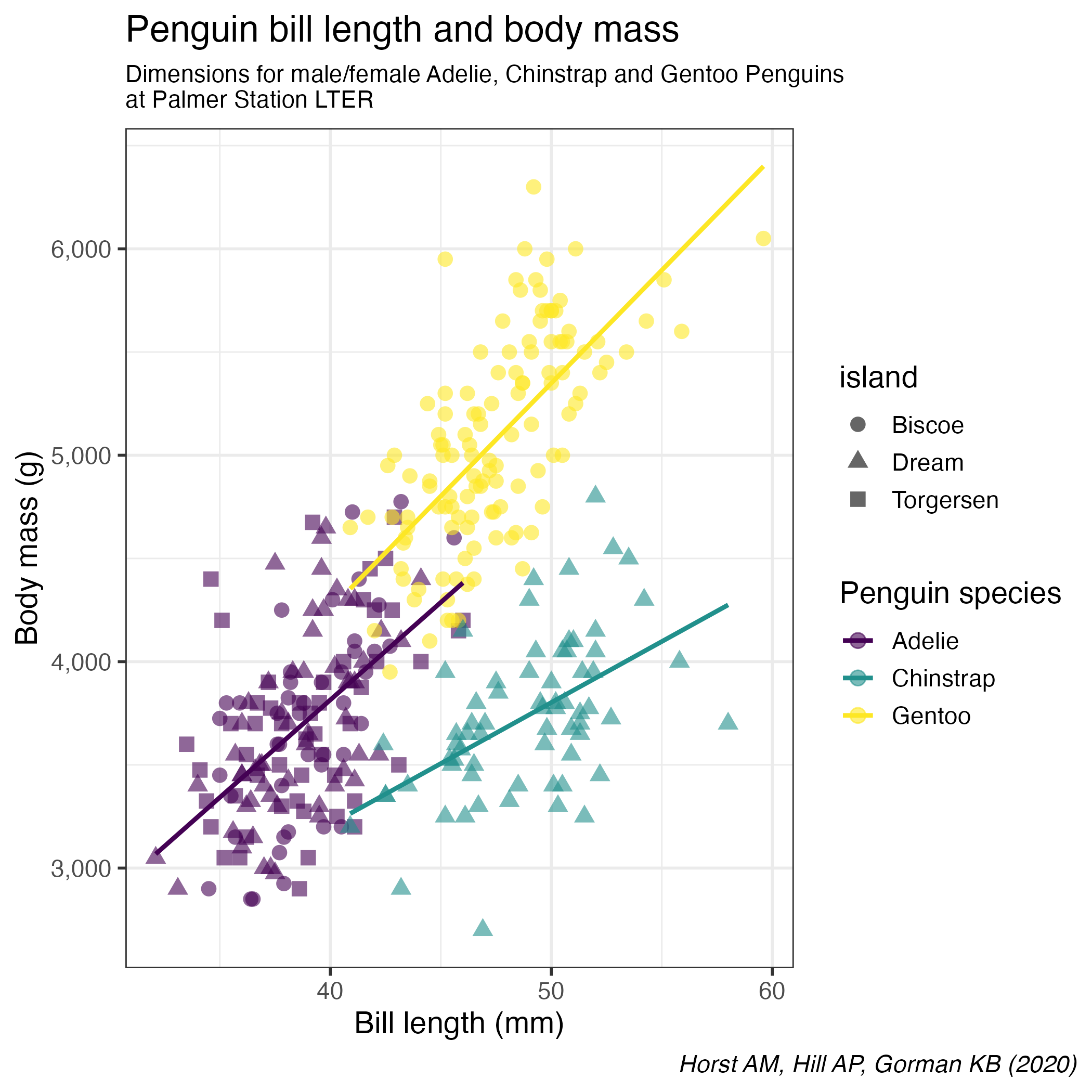
Solution
penguins |>
  ggplot(aes(x = bill_length_mm, y = body_mass_g,
             colour = species)) +
  geom_point(aes(shape = island), size = 3, alpha = 0.6) +
  geom_smooth(method = "lm", se = FALSE) +
  scale_colour_viridis_d() +
  theme_bw(14) +
  theme(plot.caption.position = "plot",
        plot.caption = element_text(face = "italic"),
        plot.subtitle = element_text(size = 11)) +
  scale_y_continuous(labels = scales::comma) +
  labs(title = "Penguin bill length and body mass",
       caption = "Horst AM, Hill AP, Gorman KB (2020)",
       subtitle = "Dimensions for male/female Adelie, Chinstrap and Gentoo Penguins\nat Palmer Station LTER",
        x = "Bill length (mm)",
       y = "Body mass (g)",
       color = "Penguin species")
`geom_smooth()` using formula = 'y ~ x'Warning: Removed 2 rows containing non-finite outside the scale range
(`stat_smooth()`).Warning: Removed 2 rows containing missing values or values outside the scale range
(`geom_point()`).
Remember that
- All aesthetics defined in the
ggplot(aes())command will be inherited by all following layers aes()of individual geoms are specific (and overwrite the global definition if present).labs()controls of plot annotationstheme()allows to tweak the plot liketheme(plot.caption = element_text(face = "italic"))to render in italic the caption
Categorical data
We are going to use a dataset from the TidyTuesday initiative. Several dataset about the theme deforestation on April 2021 were released, we will focus on the csv called brazil_loss.csv. The dataset columns are described in the linked README and the csv is directly available at this url
Load the brazil_loss.csv file, remove the 2 first columns (entity and code since it is all Brazil) and assign the name brazil_loss
Note
Set the data type of year to character().
Is this dataset tidy?
Pivot the deforestation reasons (columns commercial_crops to small_scale_clearing) to the long format. Values are areas in hectares (area_ha is a good column name). Save as brazil_loss_long
Plot the deforestation areas per year as bars
Tip
yearneeds to be a categorical datum. If you didn’t read the data as character for this column, you can convert it withfactor()geom_col()requires 2 aestheticsxmust be categorical / discrete (see first item)ymust be continuous
Solution
brazil_loss_long |>
  ggplot(aes(x = year, y = area_ha)) +
  geom_col()
Same as the plot above but bar filled by the reasons for deforestation
Solution
brazil_loss_long |>
  ggplot(aes(x = year, y = area_ha,
             fill = fct_lump_n(reasons, n = 5, w = area_ha))) +
  geom_col() +
  labs(title = "The 5 main reasons for deforestation in Brazil",
       fill = NULL)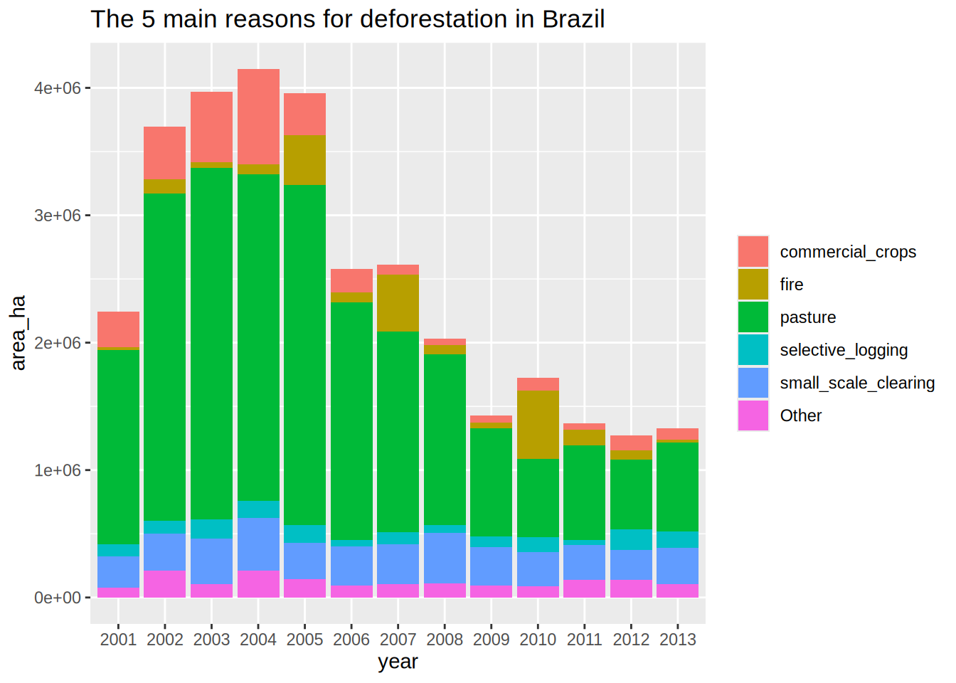
Even if we have too many categories, we can appreciate the amount of natural_disturbances versus the reasons induced by humans.
Lump the reasons for deforestations, keeping only the top 5 reasons, lumping as “Other” the rest
Tip
- The function
fct_lump_n()is very useful for this operation. Be careful to weight the categories with the appropriate continuous variable. - The legend of filled colours could be renamed and suppress if the title is explicit
Solution
brazil_loss_long |>
  ggplot(aes(x = year, y = area_ha,
             fill = fct_infreq(reasons, w = area_ha, ordered = TRUE))) +
  geom_col() +
  labs(title = "Sorted reasons for deforestation in Brazil",
       fill = NULL)
Optimize the previous plot by sorting the main deforestation reasons
forcats
Since v1.0.0, fct_infreq() does have a weight argument.
you can play with the ordered argument to get a viridis binned color scale
Solution
brazil_loss_long |>
  ggplot(aes(x = year, y = area_ha,
             fill = fct_infreq(reasons, w = area_ha, ordered = TRUE))) +
  geom_col() +
  labs(title = "Sorted reasons for deforestation in Brazil",
       fill = NULL)
Optimize the previous plot by sorting the 5 main deforestation reasons
Tip
One solution would be extract the top 5 main reasons using dplyr statements.
Then use this vector to recode the reasons with the reason name when part of the top5 or other if not. Then fct_reorder(reasons2, area_ha) does the correct reordering. You might want to use fct_rev() to have the sorting from top to bottom in the legend.
Solution
brazil_loss_long |>
  group_by(reasons) |>
  summarise(sum = sum(area_ha)) |>
  arrange(desc(sum)) |>
  slice_head(n = 5) |>
  pull(reasons) -> top_5_reasons

brazil_loss_long |>
  mutate(reasons2 = if_else(reasons %in% top_5_reasons, reasons, "other")) |>
  ggplot(aes(x = year, y = area_ha,
             fill = fct_reorder(reasons2, area_ha) |> fct_rev())) +
  geom_col() +
  scale_fill_brewer(type = "qual", palette = "Set1") +
  labs(title = "The 5 main reasons for deforestation in Brazil",
       fill = NULL)
Supplementary exercises
Note
These questions are optional and not required to be completed.
Genome-wide copy number variants (CNV) detection
Let’s have a look at a real output file for CNV detection. The used tool is called Reference Coverage Profiles: RCP.
It was developed by analyzing the depth of coverage in over 6000 high quality (>40×) genomes.
In the end, for every kb a state is assigned and similar states are merged eventually.
state means:
- 0, no coverage
- 1, deletion
- 2, expected diploidy
- 3, duplication
- 4, > 3 copies
Reading data
The file is accessible here.
CNV.seg has 5 columns and the first 10 lines look like:

Load the file CNV.seg in R, assign to the name cnv
Several issues must be fixed!
- Lines starting by a hash (comment) should be discarded. You can specify in
vroomcomment = '#'orskip = 2L - The first and last column names are unclean.
#chromcontains a hash andlength (kb). Would be neater to fix this upfront.
By skipping the 2 first lines, we need to redo the header manually, avoiding vroom to use a data line as header.
- Specify a character vector of length 5 to
col_names =to create the header
Exploratory plots
Plot the counts of the different states. We expect a majority of diploid states.
Plot the counts of the different states per chromosome. Might be worth freeing the count scale.
Solution
cnv |>
  ggplot(aes(x = state)) +
  geom_bar()
Using the previous plot, reorder the levels of chromosomes to let them appear in the karyotype order (1:22, X, Y)
Tip
We could provide the full levels lists in the desired order explicitly. In the tibble, the chromosomes appear in the right order - essentially we need to tell ggplot to keep this order.
See the fct_inorder() function in the forcats package to this end.
Solution
cnv |>
  mutate(chr = fct_inorder(chr)) |>
  ggplot(aes(x = state)) +
  geom_bar() +
  facet_wrap(~ chr, scales = "free_y")
Sexual chromosomes are not informative, collapse them into a gonosomes level
Tip
See the fct_collapse() function in the forcats
Solution
cnv |>
  mutate(chr = fct_inorder(chr) |>
           fct_collapse(gonosomes = c("X", "Y"))) |>
  ggplot(aes(x = state)) +
  geom_bar() +
  facet_wrap(~ chr, scales = "free_y")
Plot the genomic segments length per state
Tip
- The distributions are completely skewed: transform to log-scale to get a decent plot.
- Add the summary
meanandmedianwith colored hyphens using the ToothGrowth example
Of note, shape = 95 for dots is an hyphen shape.
Solution
cnv |>
  ggplot(aes(x = factor(state), y = length_kb)) +
  geom_violin() +
  geom_point(stat = "summary", fun = "mean", shape = 95,
             aes(colour = "mean"), size = 10) +
  geom_point(stat = "summary", fun = "median",
             aes(colour = "median"), size = 10, shape = 95) +
  scale_y_log10() +
  annotation_logticks(sides = "l") +
  labs(x = "State",
       y = "Length (kb)",
       colour = NULL)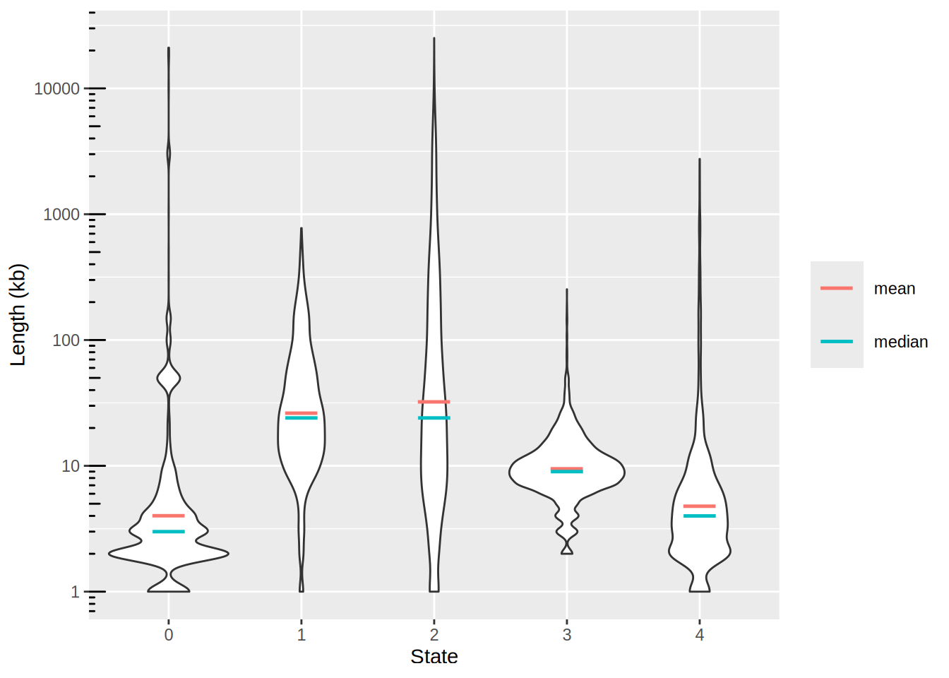
Count gain / loss summarising events per chromosome
Filter the tibble only for autosomes and remove segments with no coverage and diploid (i.e states 0 and 2 respectively). Save as cnv_auto.
We are left with state 1 and 3 and 4. Rename 1 as loss and the others as gain
Count the events per chromosome and per state
For loss counts, set them to negative so the barplot will be display up / down. Save as cnv_auto_chr
Plot cnv_auto_chr using the count as the y variable
Solution
cnv_auto_chr |>
  ggplot(aes(x = chr, fill = state, y = n)) +
  geom_col() +
  scale_y_continuous(labels = abs) + # absolute values for negative counts
  scale_x_discrete(expand = c(0, 0)) +
  scale_fill_manual(values = c("springgreen3", "steelblue2")) +
  theme_classic(14) +
  theme(legend.position = c(1, 1),
        legend.justification = c(1, 1)) +
    labs(x = NULL,
         y = "count")
Warning: A numeric `legend.position` argument in `theme()` was deprecated in ggplot2
3.5.0.
ℹ Please use the `legend.position.inside` argument of `theme()` instead.
This is the final plot, where the following changes were made:
- Labels of the
yaxis in absolute numbers - Set
expand = c(0, 0)on thexaxis. see stackoverflow’s answer - Use
theme_classic() - Set the legend on the top right corner. Use a mix of
legend.positionandlegend.justificationin atheme()call. - Remove the label of the
xaxis, you could use chromosomes if you prefer - Change the color of the
fillargument withc("springgreen3", "steelblue2")
It is now obvious that we have mainly huge deletions on chromosome 10 and amplifications on chromosome 11.
In order to plot the genomic localisations of these events, we want to focus on the main chromosomes that were affected by amplifications/deletions.
Lump the chromsomes by the number of CNV events (states 1, 3 or 4) keeping the 5 top ones and plot the counts
Solution
read_tsv("http://biostat2.uni.lu/practicals/data/CNV.seg", comment = "#",
      col_types = cols(),
             col_names = c("chr", "start", "end", "state", "length_kb")) |>
  filter(state == 1 | state > 2,
         !chr %in% c("X", "Y")) |>
  mutate(state = if_else(state == 1, "loss", "gain")) |>
  mutate(chr = fct_inorder(chr)) |>
  count(chr, state) |>
  mutate(n = if_else(state == "loss", -n, n)) |>
  ggplot(aes(x = chr, fill = state, y = n)) +
  geom_col() +
  scale_y_continuous(labels = abs) + # absolute values for negative counts
  scale_x_discrete(expand = c(0, 0)) +
  scale_fill_manual(values = c("springgreen3", "steelblue2")) +
  theme_classic(14) +
  theme(legend.position = c(1, 1),
        legend.justification = c(1, 1)) +
    labs(x = NULL,
         y = "count")
Genomic plot of top 5 chromosomes
Plot the genomic localisations of CNV on the 5 main chromosomes
forcats
The function fct_lump_n() from forcats ease lumping. Just pick n = 5 to get the top 5 chromosomes
Solution
cnv_auto |>
  mutate(top_chr = fct_lump_n(chr, n = 5)) |>
  ggplot(aes(x = top_chr)) +
  geom_bar()
# the 5 top chromosomes are then, 10, 11, 3, 12 & 5