library(ggplot2)
swiss |>
  ggplot() +
  aes(x = Education,
      y = Examination) +
  geom_point() +
scale_colour_brewer()Plotting data
ggplot, part 1
Wednesday, 12 February 2025
Introduction
About this lecture
Material and references
Learning objectives
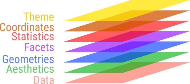
- Learn and apply the basic grammar of graphics
- Understand how it is implemented in
ggplot2- Input data structures as
data.frame/tibble - Mapping columns to display features (aesthetics)
- Types of graphics (geometries)
- Multiple and repeating graphics (facets)
- Transforming plots (scales)
- Using different coordinate systems
- Customizing graphs with themes
- Input data structures as
- Make exploratory plots of your multidimensional data.
::::
Introduction
ggplot2
- Stands for grammar of graphics plot v2
- Inspired by Leland Wilkinson work on the grammar of graphics in 2005.
Graphs are split into layers
- Such as axis, curve(s), labels.
- 3 elements are required: data, aesthetics, geometry \(\geqslant 1\)
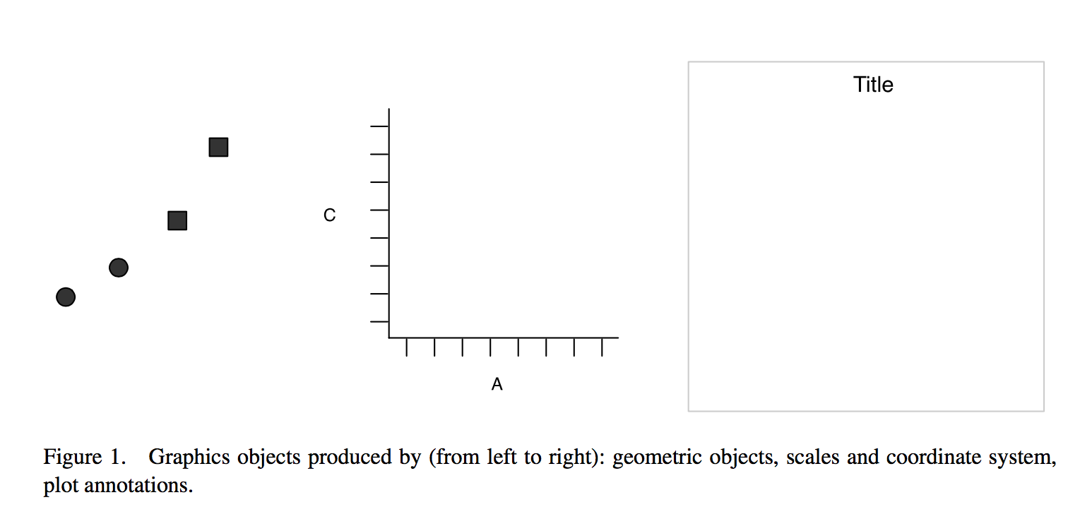
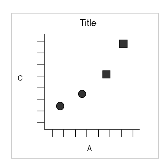
Result
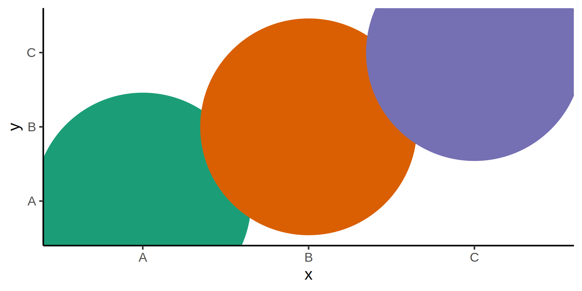
What if we want to split into panels circles and squares?
Faceting
Split by shape, aka trellis or lattice plots
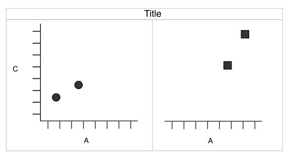
Redundancy
- shape and facets provide the same information.
- The
shapeaesthetic is free for another variable.
Familiar country shape and data
Combining layers
All ggplot layers are functions
Warning
ggplot2layers are combined with+!- The magrittr pipe
%>%or the base pipe|>will not work! - This introduces a break in the workflow.
Using the pipe has an explicit error
  ggplot(swiss) |>
  aes(x = Education,
      y = Examination) |>
  geom_point() +
  scale_colour_brewer()
Error:
! Cannot add <ggproto> objects together.
ℹ Did you forget to add this object to a <ggplot> object?Palmer penguins
Install with install.packages("palmerpenguins")
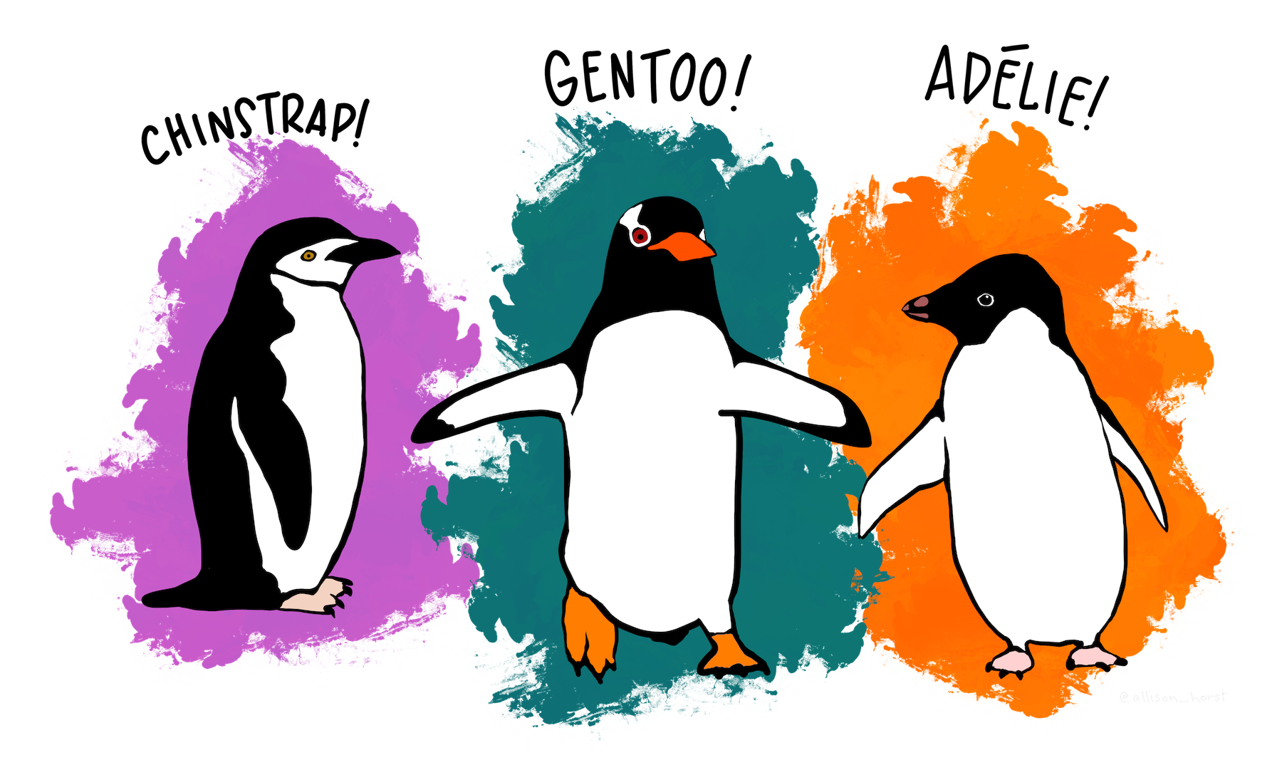
 Horst AM, Hill AP, Gorman KB (2020). palmerpenguins: Palmer Archipelago (Antarctica) penguin data. R package
 v0.1.0
library(palmerpenguins)Capabilities in ggplot
ggplot(penguins)
Capabilities in ggplot
ggplot(penguins) +
  aes(x = flipper_length_mm,
      y = body_mass_g,
      color = sex)
Capabilities in ggplot
ggplot(penguins) +
  aes(x = flipper_length_mm,
      y = body_mass_g,
      color = sex) +
  geom_point()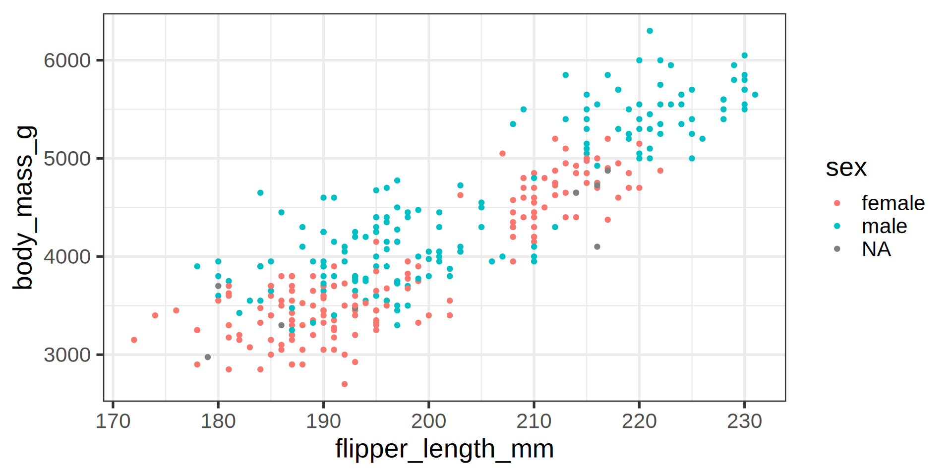
Capabilities in ggplot
ggplot(penguins) +
  aes(x = flipper_length_mm,
      y = body_mass_g,
      color = sex) +
  geom_point() +
  scale_color_manual(values = c("darkorange", "cyan4"),
na.translate = FALSE) 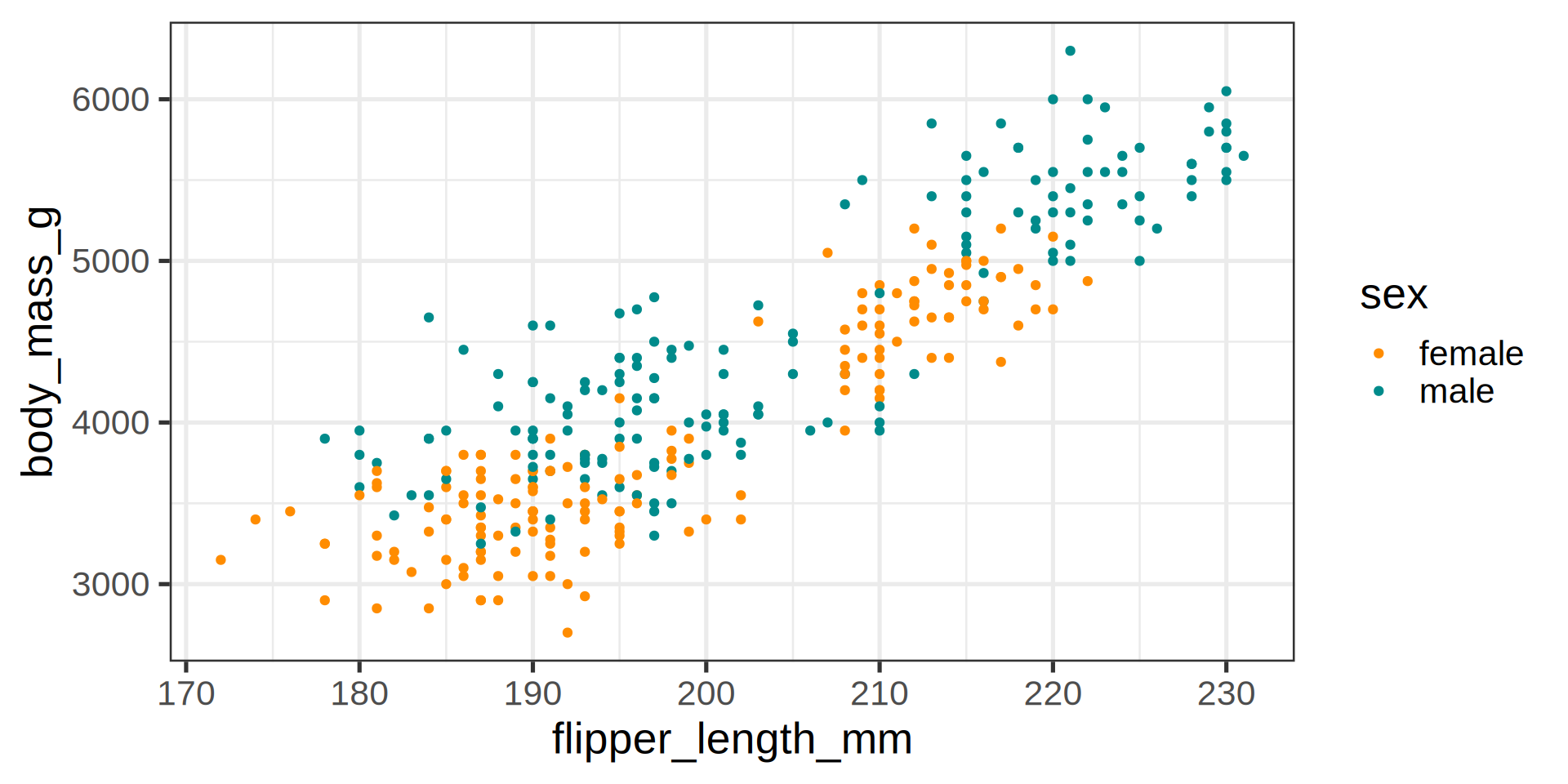
Capabilities in ggplot
ggplot(penguins) +
  aes(x = flipper_length_mm,
      y = body_mass_g,
      color = sex) +
  geom_point() +
  scale_color_manual(values = c("darkorange", "cyan4"),
                     na.translate = FALSE) +
  labs(title = "Penguin flipper and body mass",
       caption = "Horst AM, Hill AP, Gorman KB (2020)",
       subtitle = "Dimensions for male/female Adelie, Chinstrap and Gentoo Penguins at Palmer Station LTER",
       x = "Flipper length (mm)",
       y = "Body mass (g)",
       color = "Penguin sex")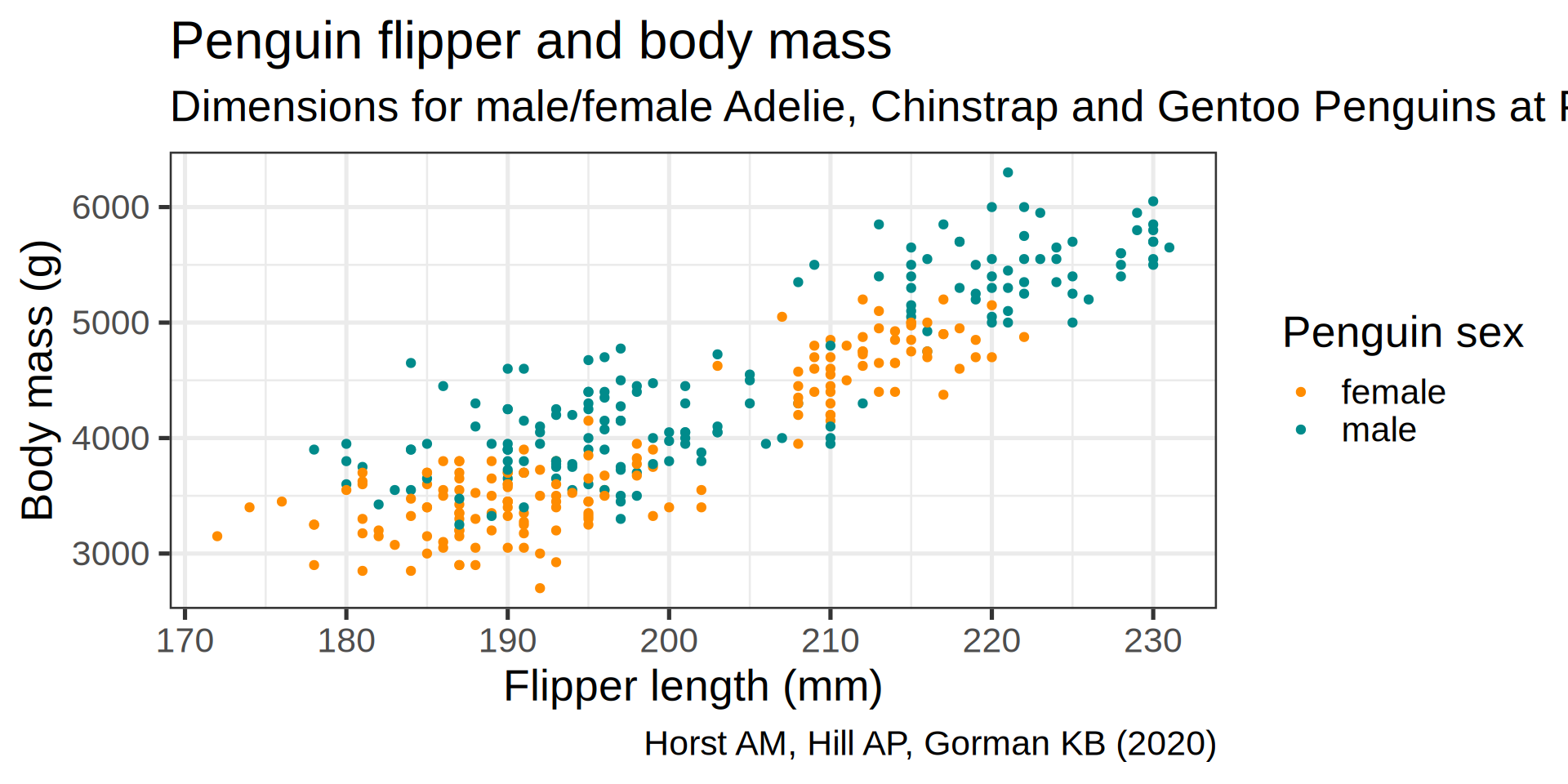
Capabilities in ggplot
ggplot(penguins) +
  aes(x = flipper_length_mm,
      y = body_mass_g,
      color = sex) +
  geom_point() +
  scale_color_manual(values = c("darkorange", "cyan4"), na.translate = FALSE) +
  labs(title = "Penguin flipper and body mass",
       caption = "Horst AM, Hill AP, Gorman KB (2020)",
       subtitle = "Dimensions for male/female Adelie, Chinstrap and Gentoo Penguins at Palmer Station LTER",
       x = "Flipper length (mm)",
       y = "Body mass (g)",
       color = "Penguin sex") +
  theme(plot.subtitle = element_text(size = 13),
axis.title = element_text(size = 11)) 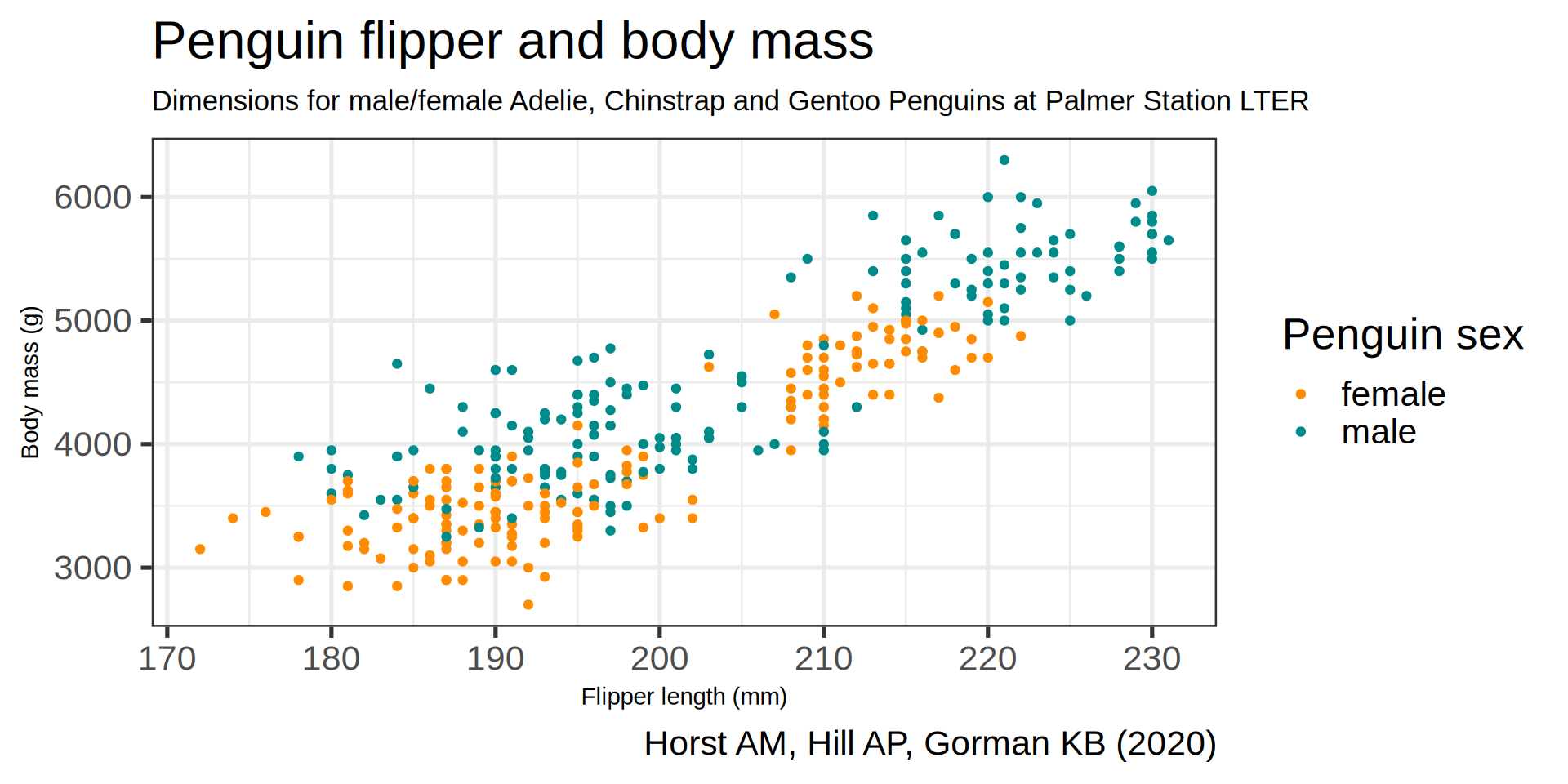
Capabilities in ggplot
ggplot(penguins) +
  aes(x = flipper_length_mm,
      y = body_mass_g,
      color = sex) +
  geom_point() +
  scale_color_manual(values = c("darkorange", "cyan4"), na.translate = FALSE) +
  labs(title = "Penguin flipper and body mass",
       caption = "Horst AM, Hill AP, Gorman KB (2020)",
       subtitle = "Dimensions for male/female Adelie, Chinstrap and Gentoo Penguins at Palmer Station LTER",
       x = "Flipper length (mm)",
       y = "Body mass (g)",
       color = "Penguin sex") +
  theme(plot.subtitle = element_text(size = 13),
        axis.title   = element_text(size = 11)) +
  theme(legend.position = "bottom",
legend.background = element_rect(fill = "white", color = NA)) 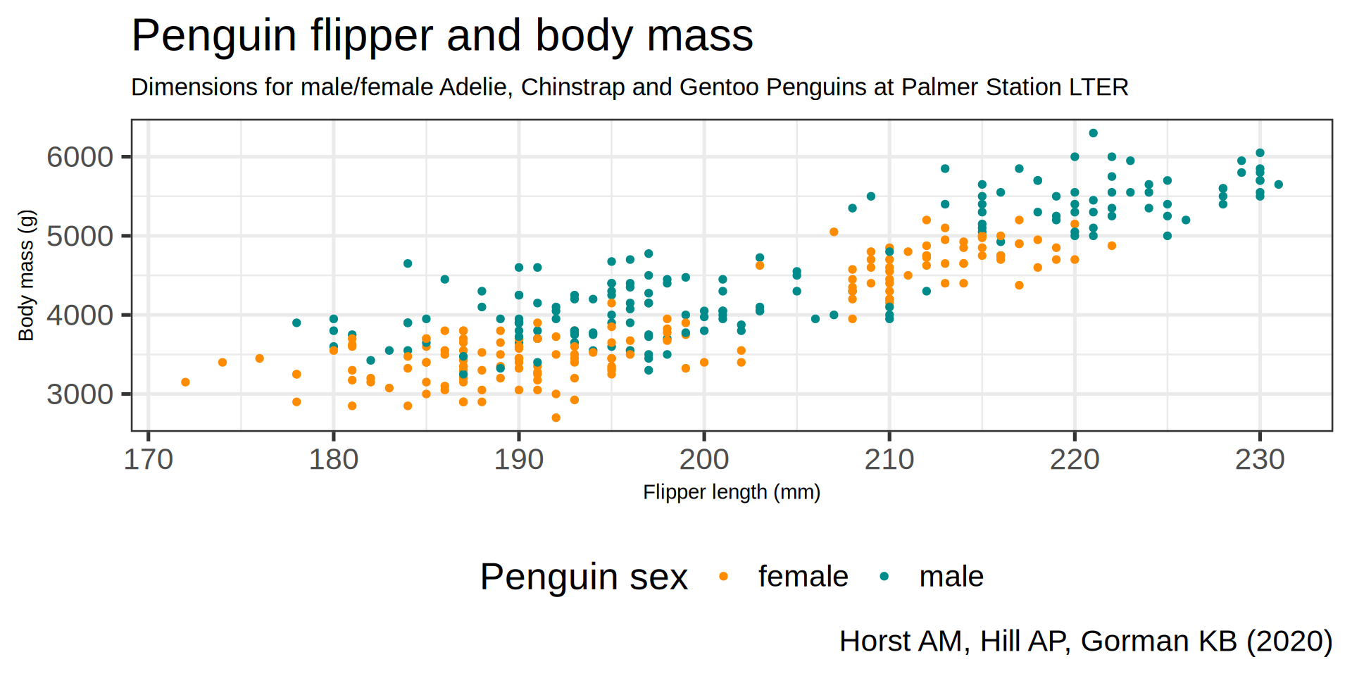
Capabilities in ggplot
ggplot(penguins) +
  aes(x = flipper_length_mm, y = body_mass_g, color = sex) +
  geom_point() +
  scale_color_manual(values = c("darkorange", "cyan4"), na.translate = FALSE) +
  labs(title = "Penguin flipper and body mass",
       caption = "Horst AM, Hill AP, Gorman KB (2020)",
       subtitle = "Dimensions for male/female Adelie, Chinstrap and Gentoo Penguins at Palmer Station LTER",
       x = "Flipper length (mm)",
       y = "Body mass (g)",
       color = "Penguin sex") +
  theme(plot.subtitle = element_text(size = 13),
        axis.title   = element_text(size = 11)) +
  theme(legend.position = "bottom",
        legend.background = element_rect(fill = "white", color = NA)) +
  theme(plot.caption = element_text(hjust = 0, face = "italic"),
        plot.caption.position = "plot") +
  facet_wrap(vars(species))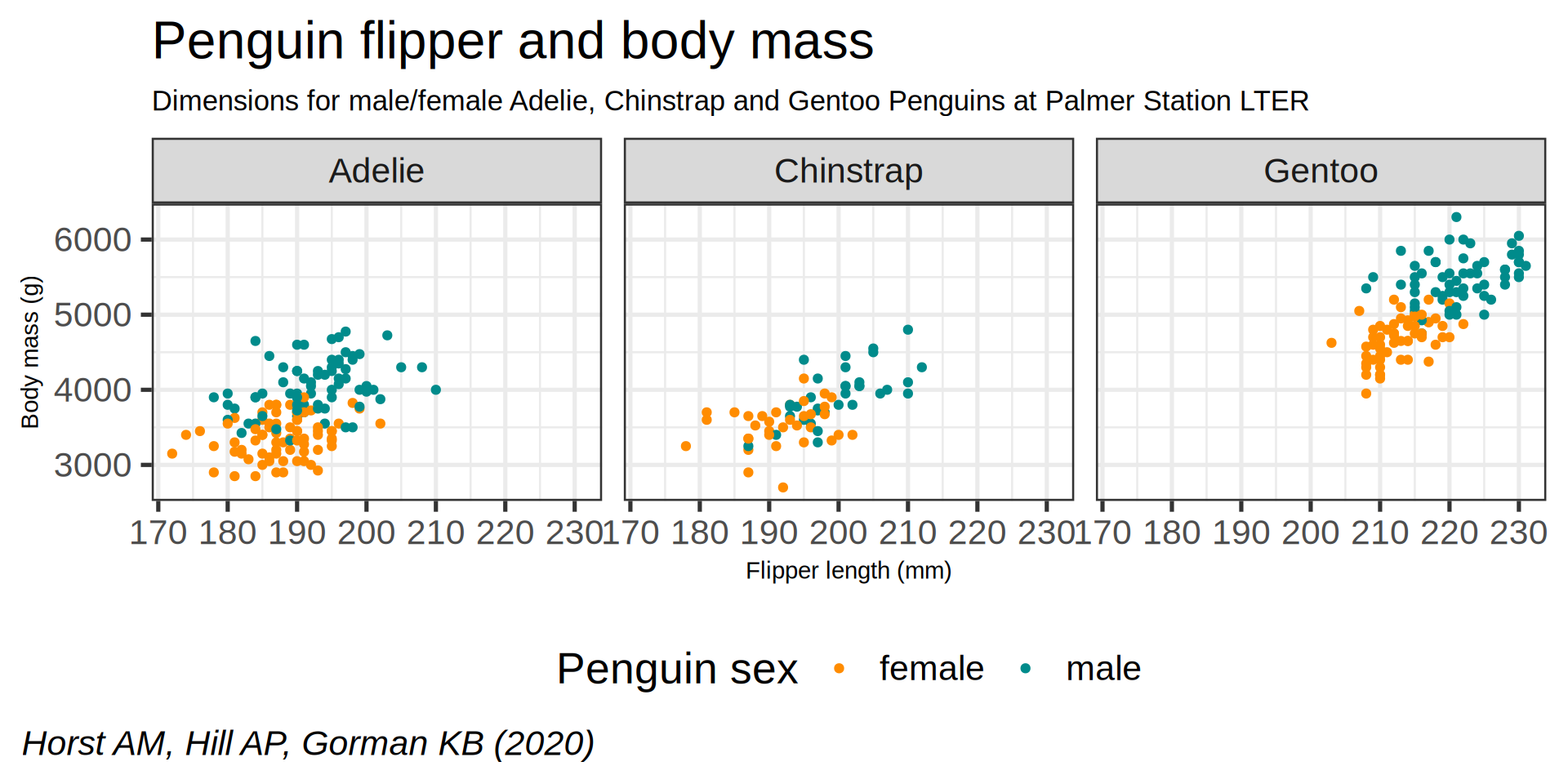
Capabilities in ggplot
ggplot(penguins) +
  aes(x = flipper_length_mm, y = body_mass_g, color = sex) +
  geom_point() +
  scale_color_manual(values = c("darkorange", "cyan4"), na.translate = FALSE) +
    labs(title = "Penguin flipper and body mass",
       caption = "Horst AM, Hill AP, Gorman KB (2020)",
       subtitle = "Dimensions for male/female Adelie, Chinstrap and Gentoo Penguins at Palmer Station LTER",
       x = "Flipper length (mm)",
       y = "Body mass (g)",
       color = "Penguin sex") +
  theme(plot.subtitle = element_text(size = 13),
        axis.title   = element_text(size = 11)) +
  theme(legend.position = "bottom",
        legend.background = element_rect(fill = "white", color = NA)) +
  theme(plot.caption = element_text(hjust = 0, face = "italic"),
        plot.caption.position = "plot") +
  facet_wrap(vars(species)) +
  scale_x_continuous(guide = guide_axis(n.dodge = 2)) +
  scale_y_continuous(labels = scales::label_comma())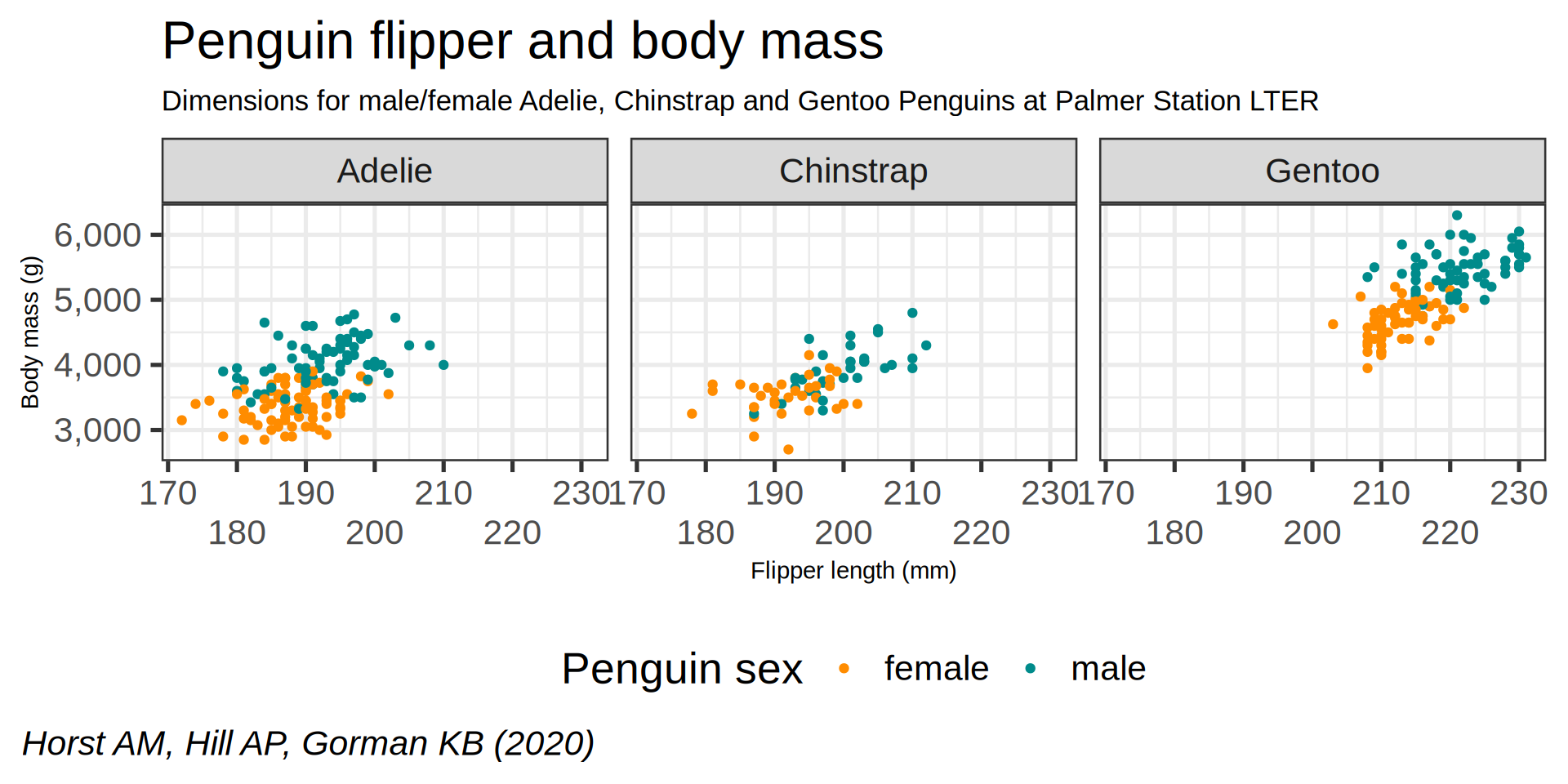
Geometric objects define the plot type to be drawn
geom_point()
geom_line()
geom_bar()
geom_violin()
geom_histogram()
geom_density()
Core layers

Other layers
They are present, it works because they have sensible default:
- Theme is
theme_grey - Coordinate is
cartesian - Statistic is
identity - Facets are
disabled
3 layers are enough
- Data
- Aesthetics mapping data to plot component
- Geometry at least one
Your first plot
library(palmerpenguins)
library(ggplot2)
ggplot(data = penguins) +
  geom_point(mapping = aes(x = bill_length_mm,
                           y = bill_depth_mm,
                           colour = species))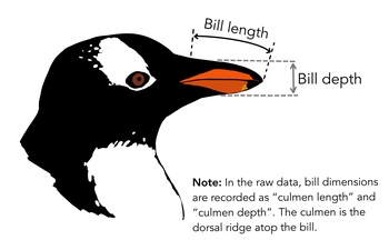
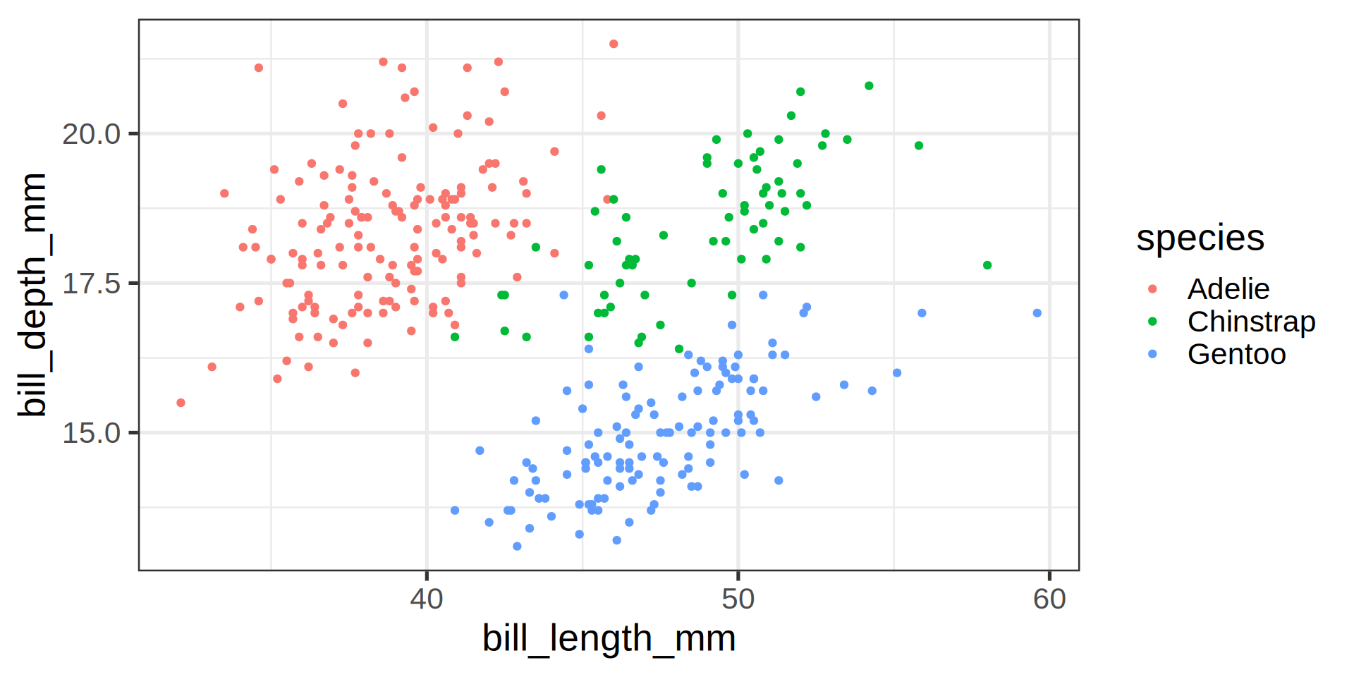
My first plot
ggplot(data = penguins) +
  geom_point(mapping = aes(x = bill_length_mm,
                           y = bill_depth_mm,
                           colour = "green"))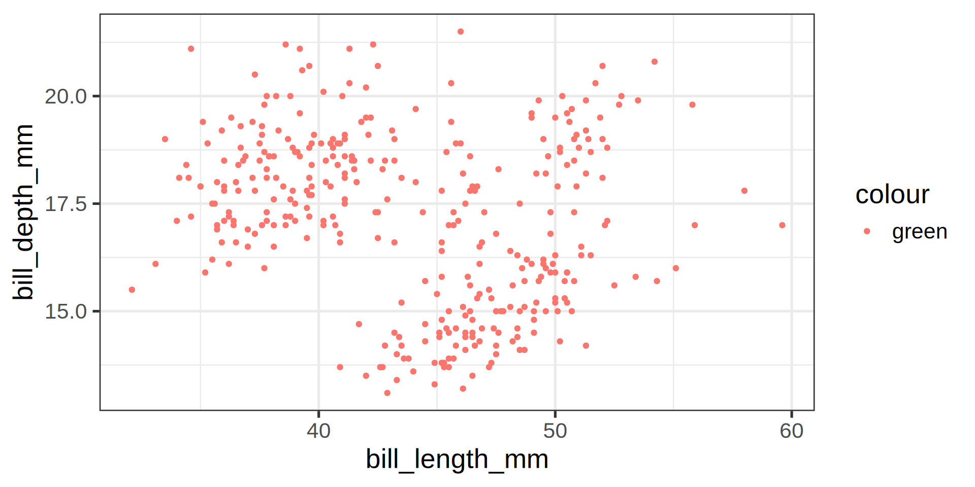
Mapping aesthetics
Requirements
aes()map columns/variables data to aesthetics- Specific geometries (
geom) have different expectations:- univariate, one x or y for flipped axes
- bivariate, x and y like scatterplot
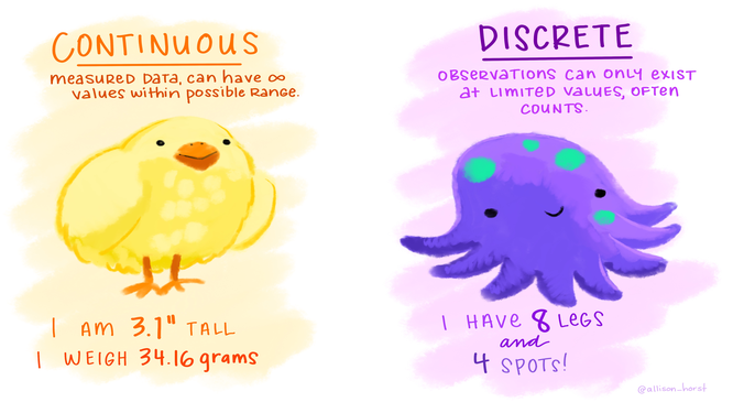
- Continuous or Discrete variables
- Continuous for color ➡️ gradient
- Discrete for color ➡️ qualitative
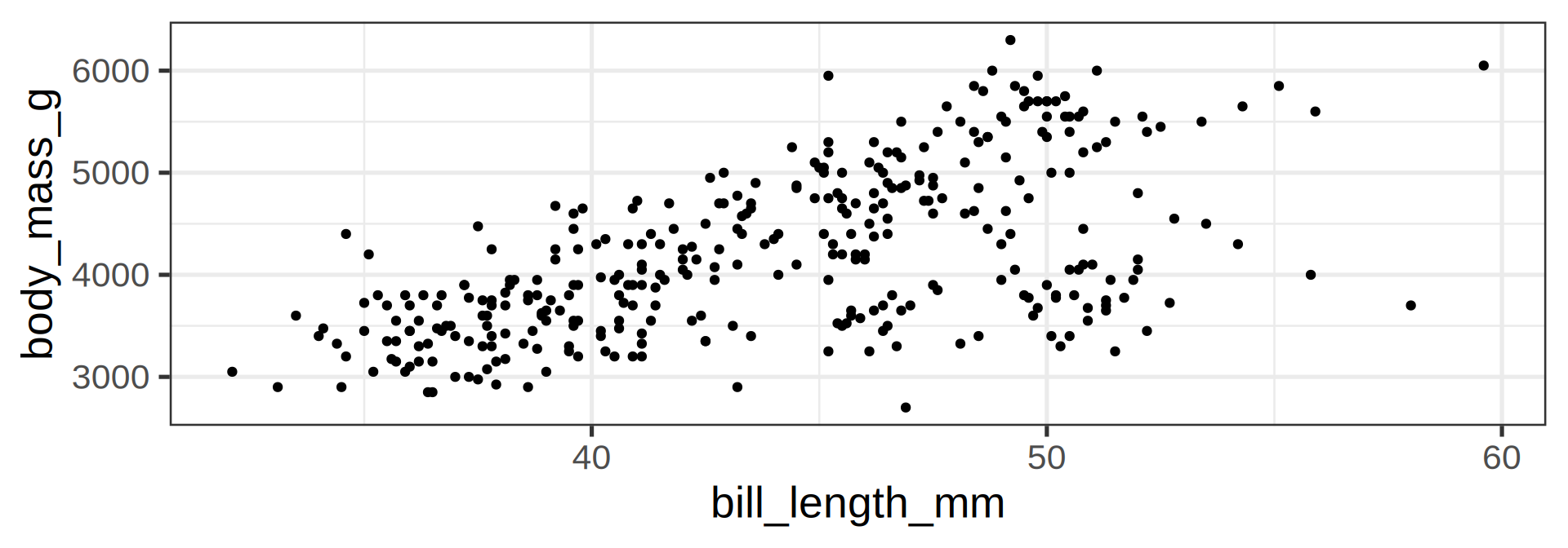
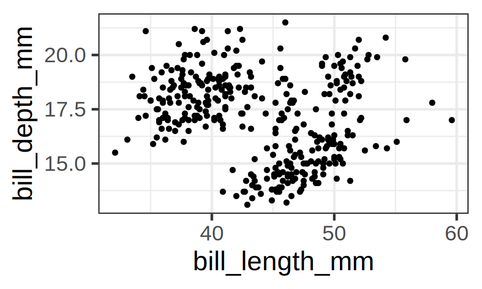
geom_point() requires both x and y coordinates
ggplot(penguins) +
  geom_point(aes(x = bill_length_mm,
y = bill_depth_mm))- Same as previous slide
- Without
colourmapping
Unmapped parameters
geom_point()accepts additional arguments such as thecolour- Define them to a fixed value without mapping
ggplot(penguins) +
  geom_point(aes(x = bill_length_mm,
                 y = bill_depth_mm),
             colour = "black")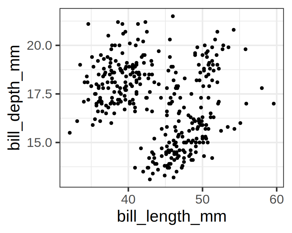
Important
Parameters defined outside the aesthetics aes() are applied to all data.
Mapped parameters
Mapped parameters require two conditions:
- Being defined inside the aesthetics
aes() - Refer to one of the column data, here: mistake
Error in FUN(X[[i]], ...): object 'country' not found- Passing the unknown column as
stringas a different effect:
ggplot(penguins) +
  geom_point(aes(x = bill_length_mm,
                 y = bill_depth_mm,
                 colour = "country"))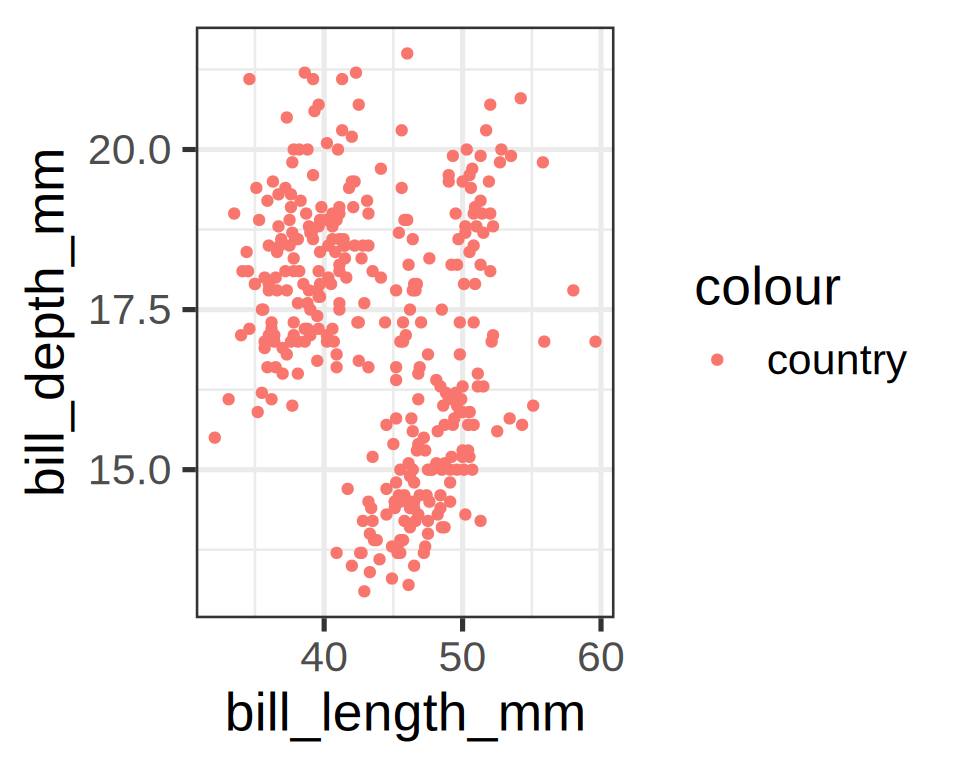
- This is hardly useful, but we shall see an application later.
- Stick to the two mapping rules:
- In
aes() - Refer to a valid column.
- In
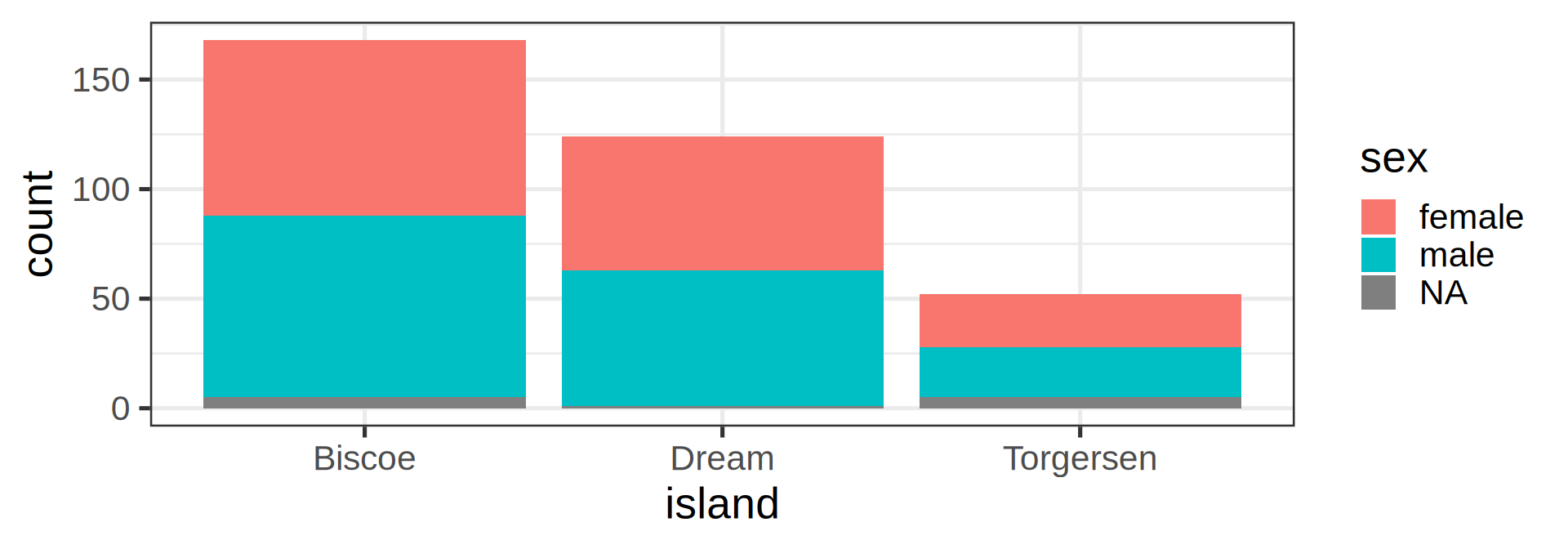
Mapping aesthetics correctly
In aes() and refer to a data column
ggplot(penguins) +
  geom_bar(aes(y = species,
               fill = sex))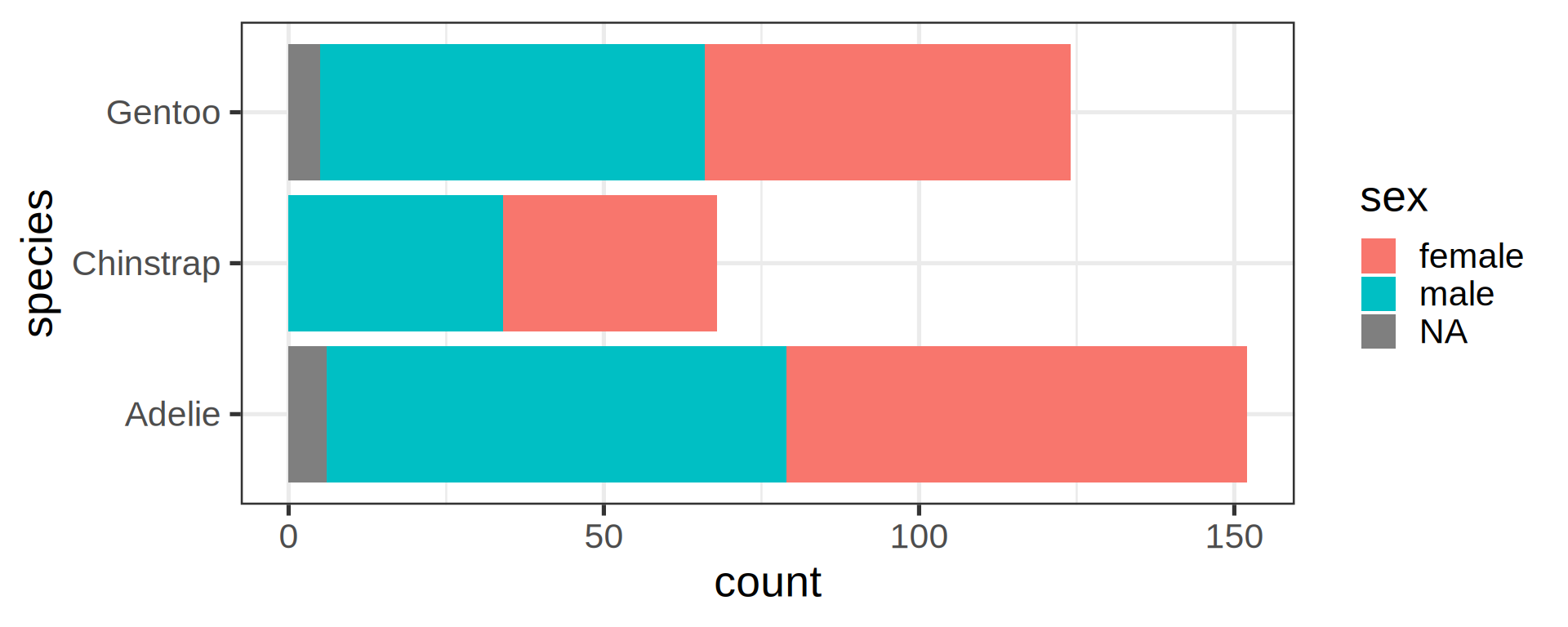
species and sex are 2 valid columns in penguins
Advantages:
- The legend 🟥/🟦 for free
- Missing data are highlighted in grey ⬜️
- Using
yaxis for categories eases reading
Why no string for mapping?
- Could we pass an
expression? - Which penguins are above 4 kg?
- Use
body_mass_g > 4000that return a boolean to find out
ggplot(penguins) +
  geom_bar(aes(y = species,
               fill = body_mass_g > 4000))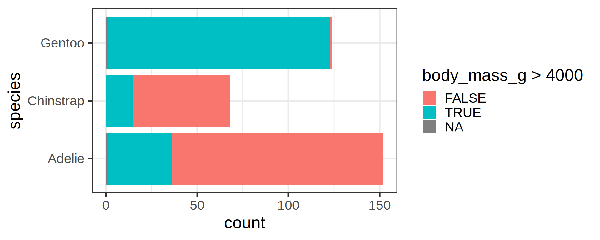
The expression was evaluated in penguins context Obvious that Gentoo are bigger than the 2 other species
Inheritance of arguments across layers
Compare the code and the results
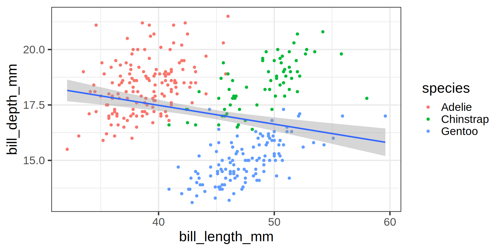
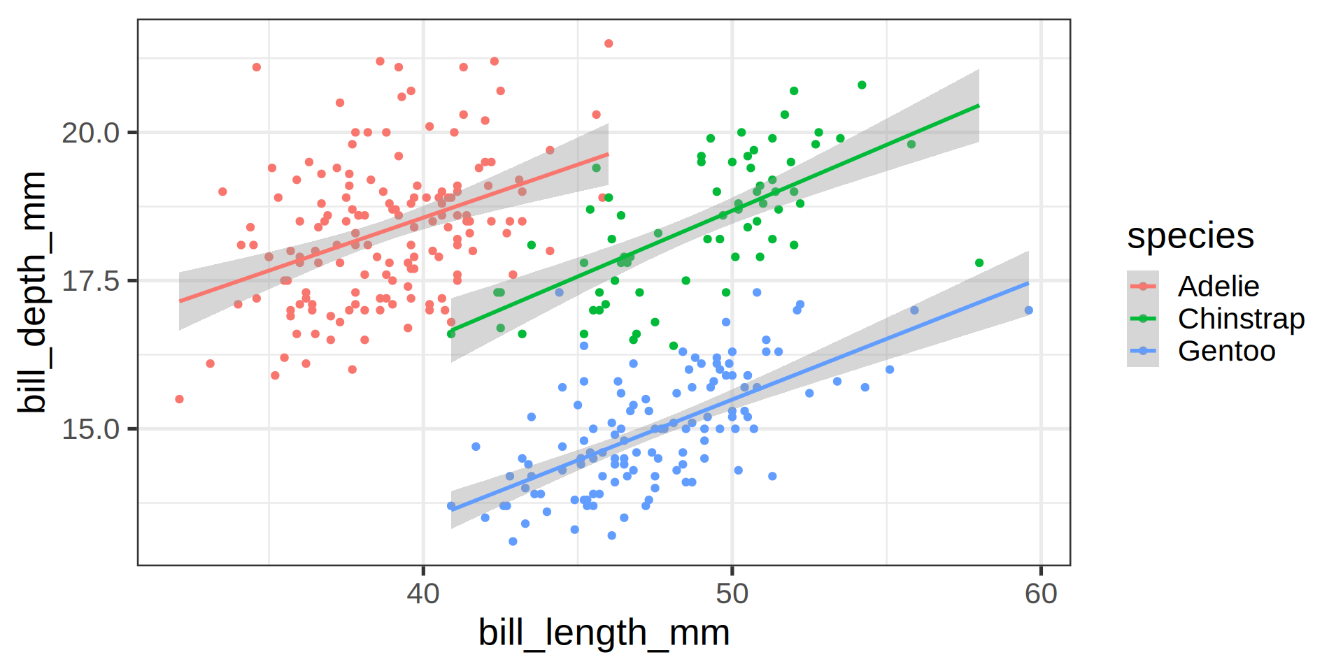
Note
aestheticsinggplot()are passed on to allgeometries.aestheticsingeom_*()are specific (and can overwrite inherited)
Simpson’s paradox
Statistical correlation depending on stratification.
Your turn!
- Use the classroom practical 5.
- Install
palmerpenguinspackage if you haven’t yet - Use the
penguinsdata set and plotbill_length_mm,bill_depth_mmandspecies. - Map the variable
islandto the aestheticsshape. - Add a regression line using a linear model.
- All dots (circles / triangles / squares) with:
- A size of
5 - A transparency of 30% (
alpha = 0.7)
- A size of
Goal
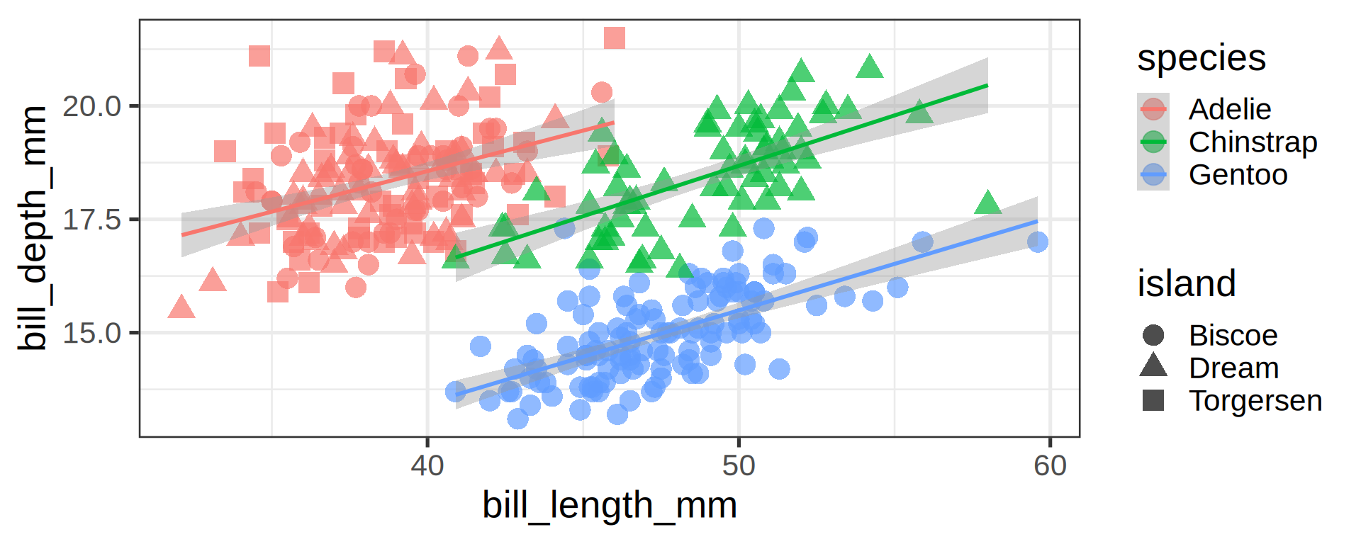
05:00
Answer:
ggplot(penguins,
       aes(x = bill_length_mm,
           y = bill_depth_mm,
           colour = species)) +
  geom_point(aes(shape = island),
             size = 5, alpha = 0.7) +
  geom_smooth(method = "lm",
              formula = 'y ~ x')
Joining observations
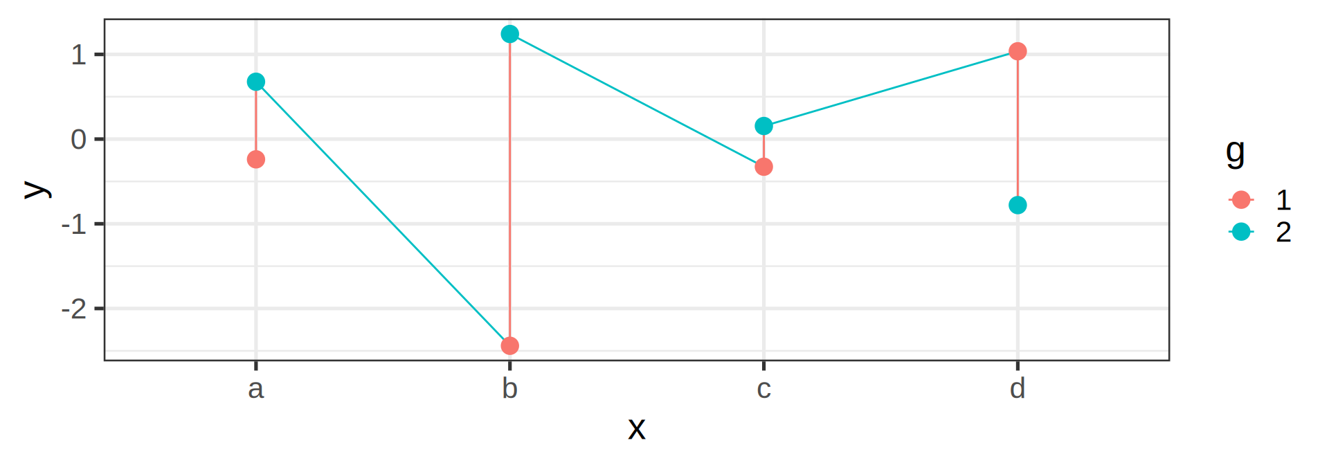
set.seed(212) # tidyr::crossing generate combinations
tib <- tibble(crossing(x = letters[1:4],
g = factor(1:2)),
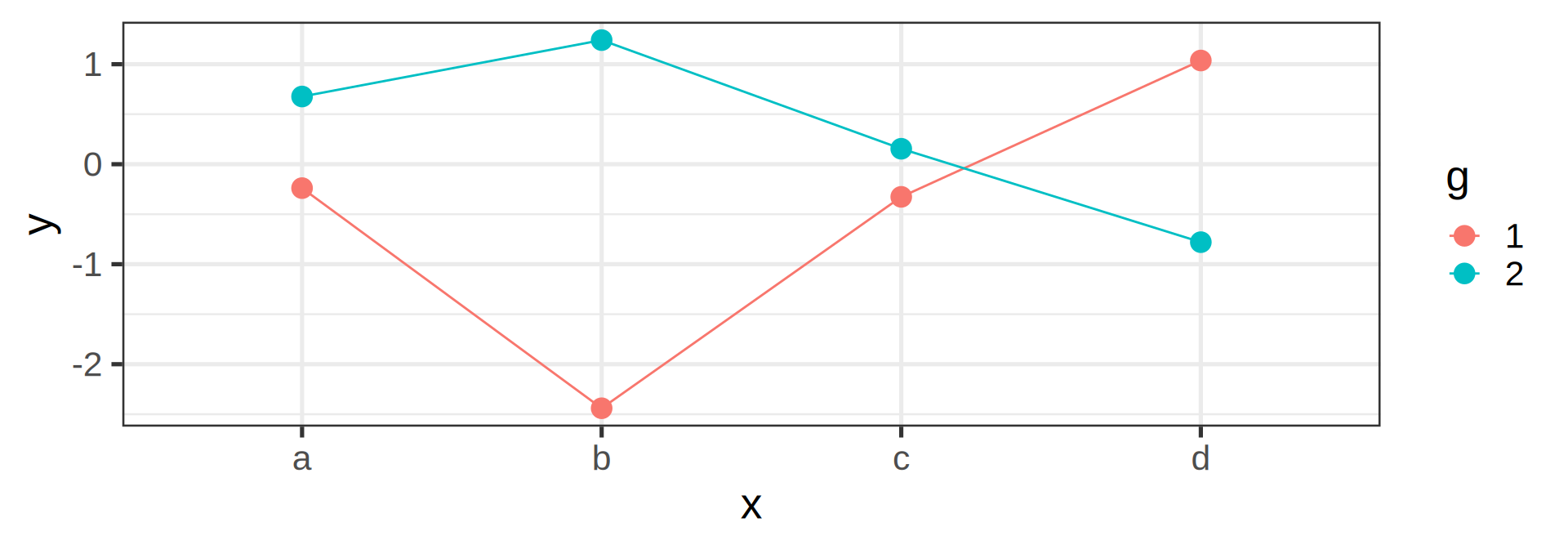
y = rnorm(8))Suppose we want to connect dots by colors
tib# A tibble: 8 × 3
x g y
<chr> <fct> <dbl>
1 a 1 -0.239
2 a 2 0.677
3 b 1 -2.44
4 b 2 1.24
5 c 1 -0.327
6 c 2 0.154
7 d 1 1.04
8 d 2 -0.780Warning
Should be the job of geom_line()
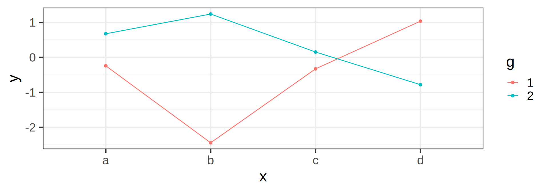
Invisible aesthetic: grouping
ggplot(tib, aes(x, y, colour = g)) +
  geom_line() +
  geom_point(size = 4)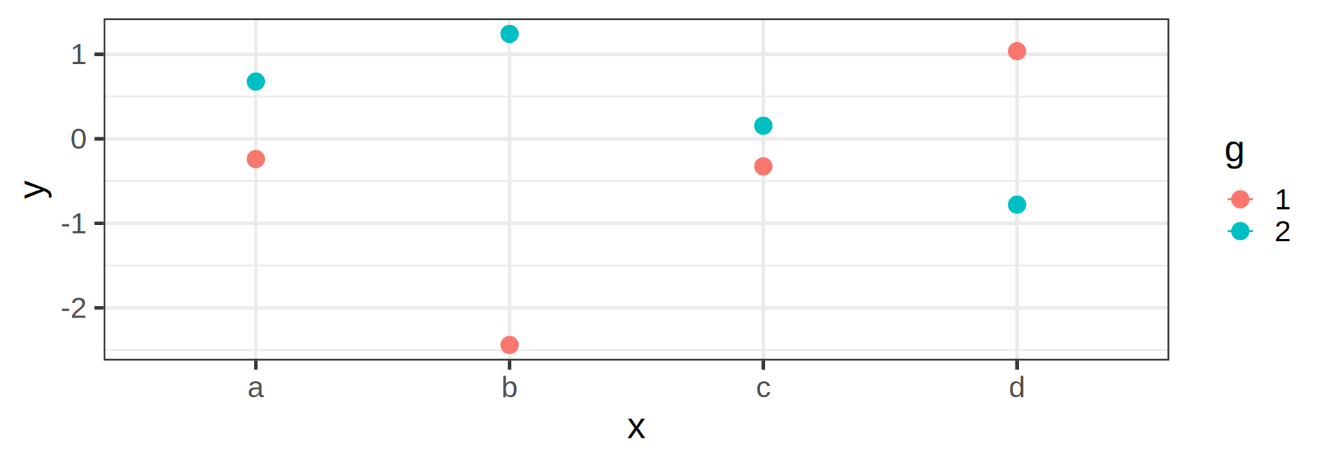
Labels
ggplot(penguins,
       aes(x = bill_length_mm,
           y = bill_depth_mm,
           shape = island,
           colour = species)) +
  geom_point() +
  geom_smooth(method = "lm",
              formula = 'y ~ x') +
  labs(title = "Bill ratios of Palmer penguins",
       caption = "Horst AM, Hill AP, Gorman KB (2020)",
       subtitle = "Split per species / island",
       shape = "Islands",
       x = "cumen length (mm)",
       y = "cumen depth (mm)")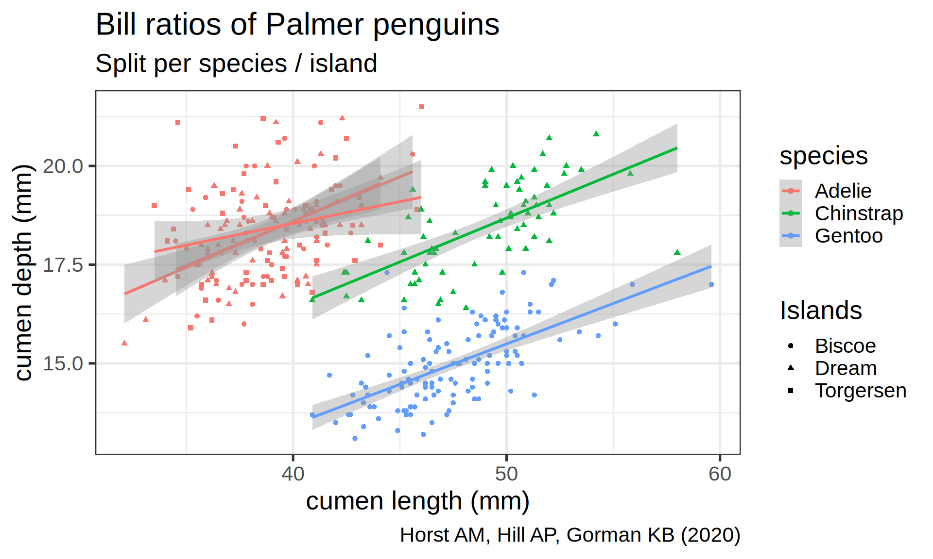
Statistics / geometries are interchangeable
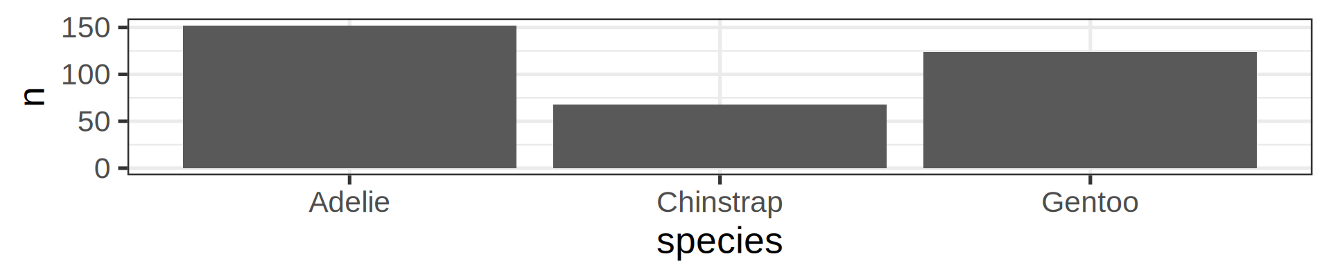
ggplot(penguins) +
  geom_bar(aes(y = species))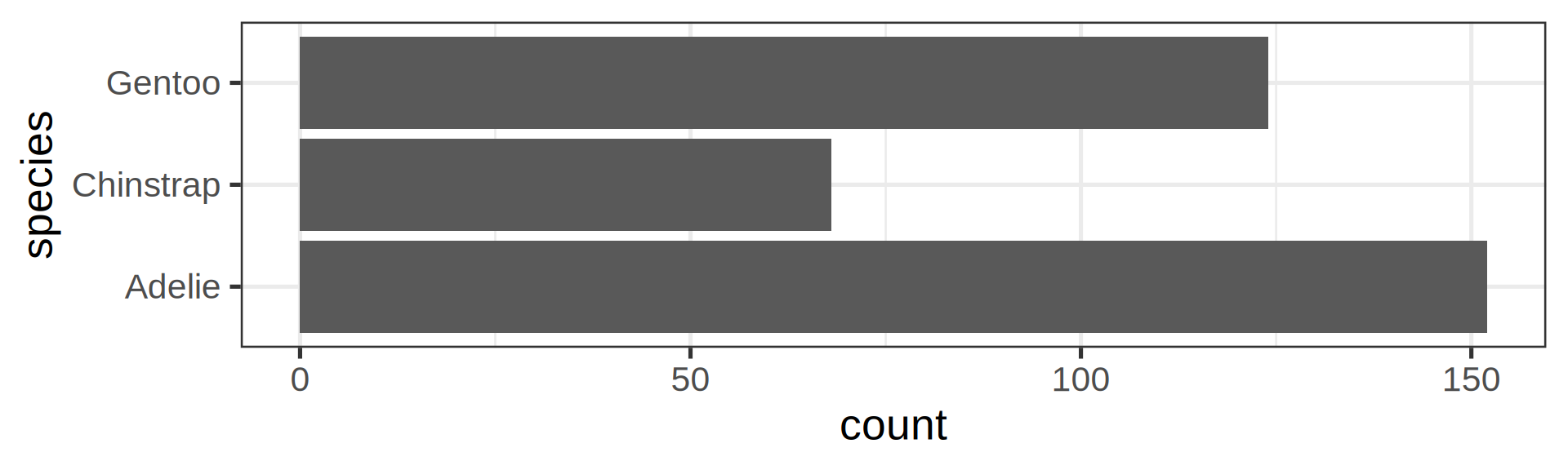
ggplot(penguins) +
  stat_count(aes(y = species))
Tip
- Feels more natural since visual
- But just a preference
- Most code in the wild use
geom
Let ggplot2 doing the stat for you
stat_count could be omitted since default
ggplot(penguins, aes(x = species)) +
  geom_bar(stat = "count")
stat_count acts on the mapped var like dplyr::count()
count(penguins, species)# A tibble: 3 × 2
species n
<fct> <int>
1 Adelie 152
2 Chinstrap 68
3 Gentoo 124Or do it yourselft, but with geom_col()

The stat() function allows computation, like proportions
Classic counting
ggplot(penguins, aes(y = species)) +
  geom_bar(aes(x = stat(count)))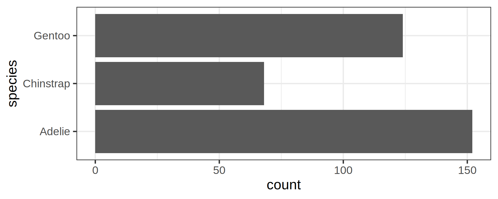
See list in help pages
ggplot(penguins, aes(y = species)) +
  geom_bar(aes(x = stat(count) / sum(count))) +
  scale_x_continuous(labels = scales::label_percent())
- Now compute proportions
- Bonus: get
xscale in%usingscales
Flexibility in the asthetics for flipping axes
geom_bar() requires x OR y
penguins |>
  # horizontal brings readability
  ggplot(aes(y = species)) +
  geom_bar()
Cleanup plot
penguins |>
  ggplot(aes(y = species)) +
  geom_bar() +
  labs(y = NULL) +
  scale_x_continuous(expand = c(0, NA))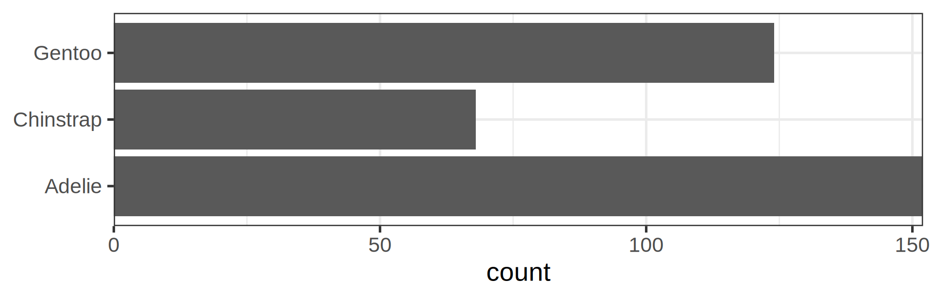
Annoying to see those 3 bars in disorder
Reorder the categorical variable (forcats)
Using the function fct_infreq()
library(forcats)
penguins |>
  ggplot(aes(y = fct_infreq(species))) +
  geom_bar() +
  scale_x_continuous(expand = c(0, NA)) +
  labs(title = "Palmer penguins species",
       y = NULL) +
  theme_minimal(14) +
  # nice trick from T. Pedersen
  theme(panel.ontop = TRUE,
        # better to hide the horizontal grid lines
panel.grid.major.y = element_blank())- See the new article FAQ about reordering.
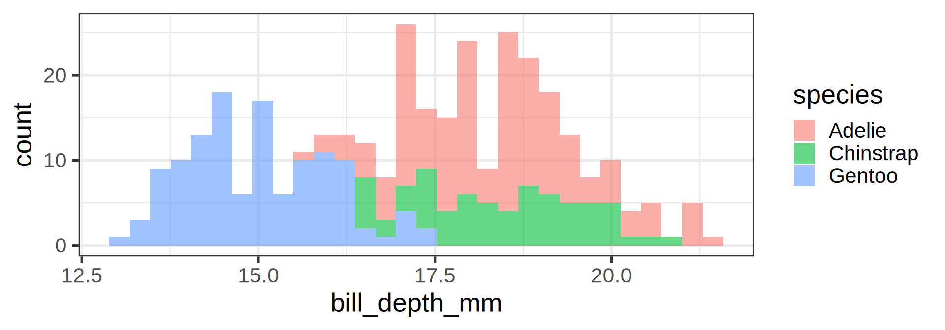
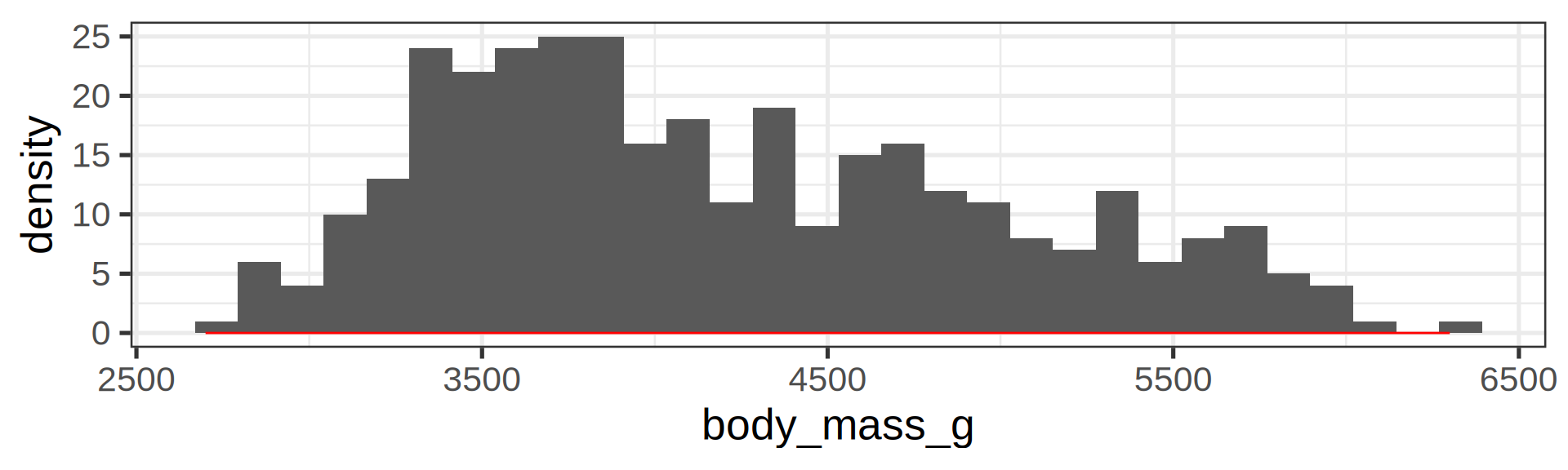
Histograms
penguins |>
ggplot(aes(x = body_mass_g,
           fill = species)) +
  geom_histogram(bins = 35,
                 alpha = 0.7,
                 position = "identity")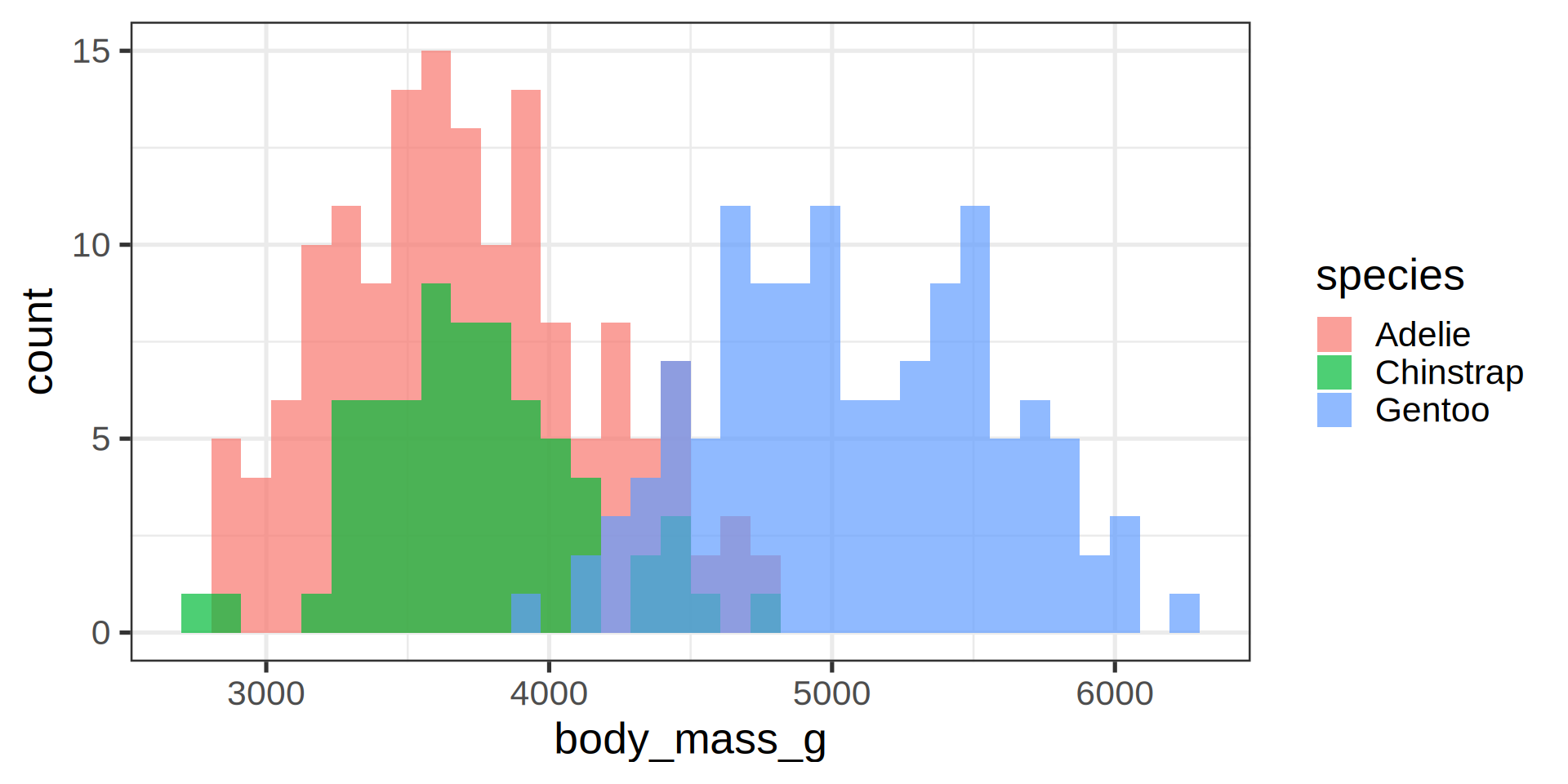
- Default
binvalue is30and will be printed out as a message - Default is
stackfor theposition. Here we overlay and use transparency
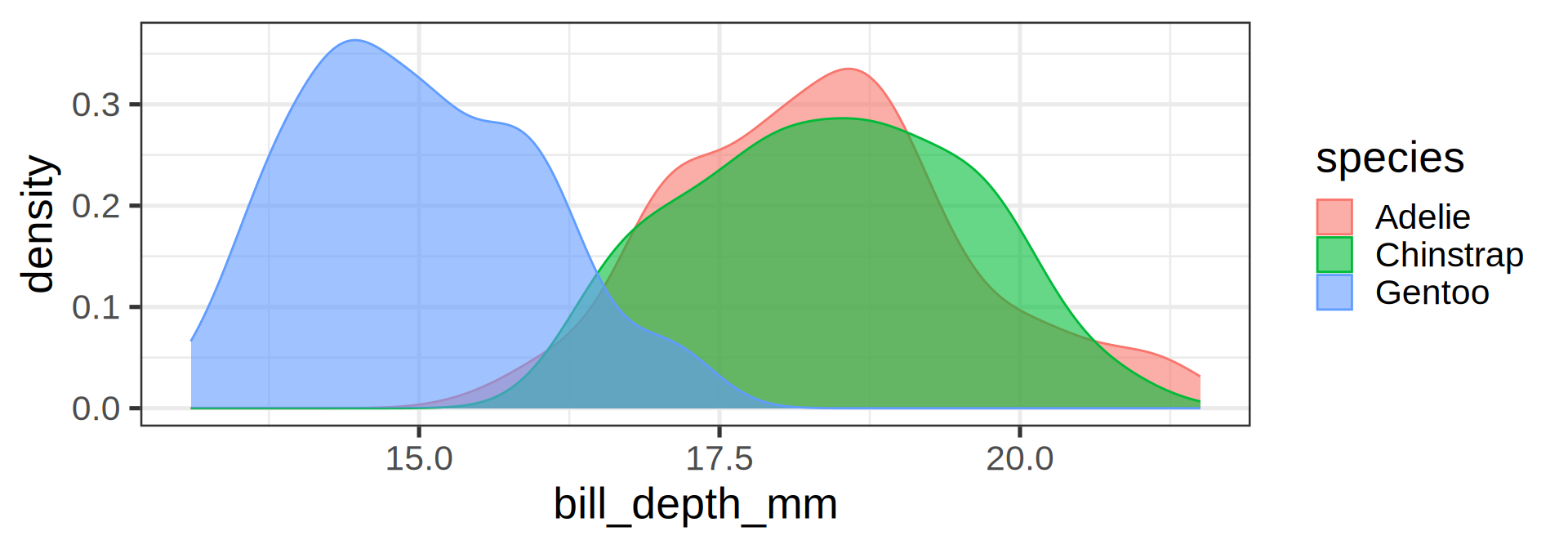
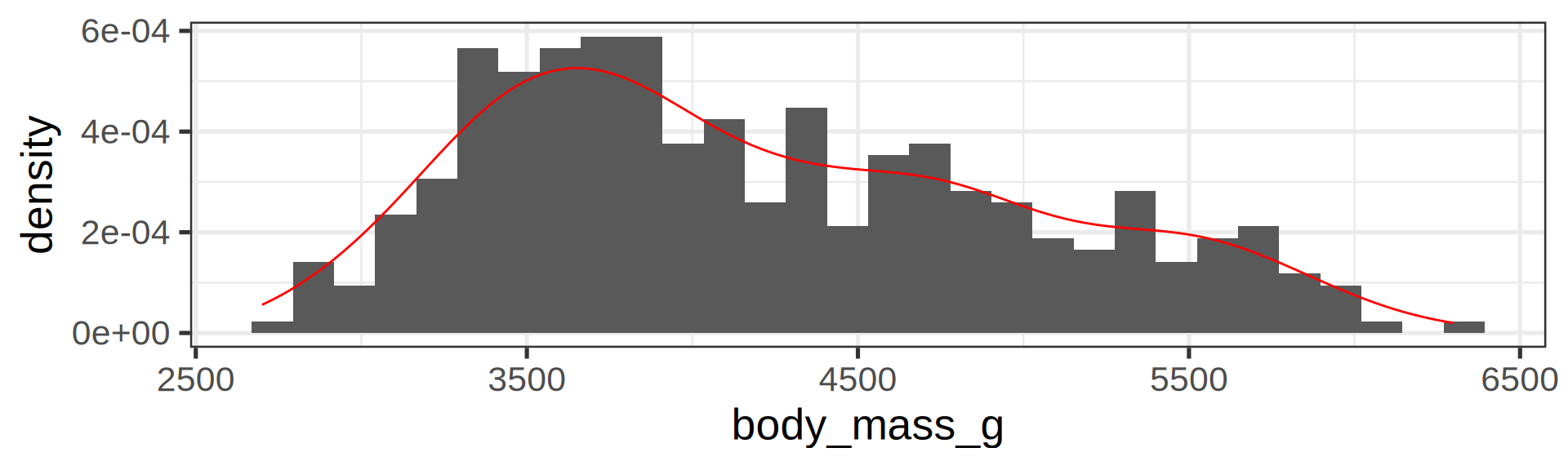
Density plots
penguins |>
ggplot(aes(x = body_mass_g,
           fill = species,
           colour = species)) +
  geom_density(alpha = 0.7)
- Use both
colourandfillmapped to the same variable for cosmetic purposes
Overlay density and histogram
Barplot, categories
Default: position = "stack"
ggplot(penguins) +
  geom_bar(aes(y = species,
               fill = island))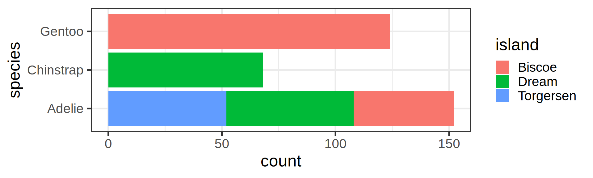
Dodging island: side by side
ggplot(penguins) +
  geom_bar(aes(y = species, fill = island),
           position = "dodge")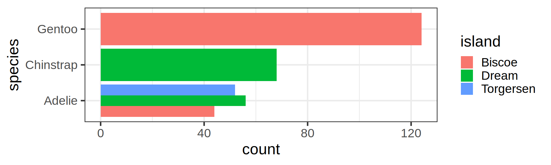
But global width per species is preserved
Preserve single bar
ggplot(penguins) +
  geom_bar(aes(y = species,
           fill = island),
           position = position_dodge2(preserve = "single")) +
  labs(y = NULL)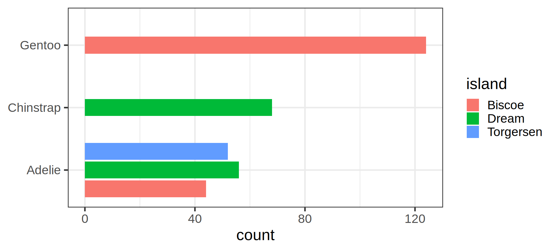
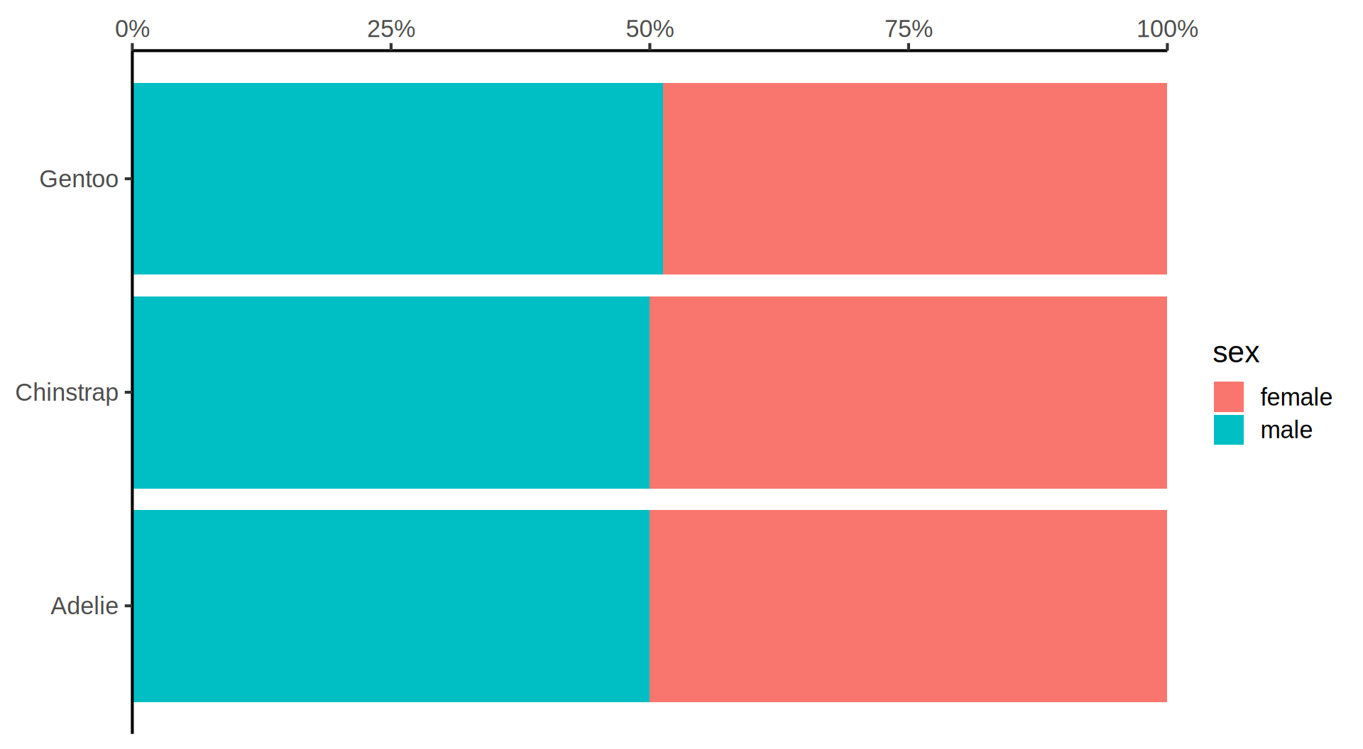
Stacked barchart for proportions
Pie charts transform coordinate system


Boxplot, a continuous y by a categorical x
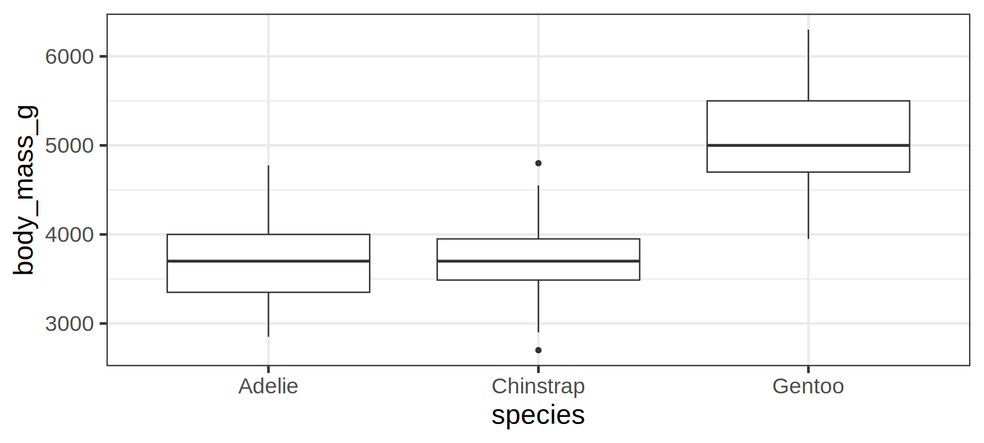
ggplot(penguins) +
  geom_boxplot(aes(y = body_mass_g,
                   x = species))
Note
geom_boxplot() is assessing that:
body_mass_gis continuousspeciesis categorical/discrete
Boxplot, dodging by default
Filter out NA to avoid this category
penguins |> # alternative to tidyr::drop_na()
  filter(!is.na(sex)) |>
  ggplot() +
  geom_boxplot(aes(y = body_mass_g,
                   x = species,
                   fill = sex))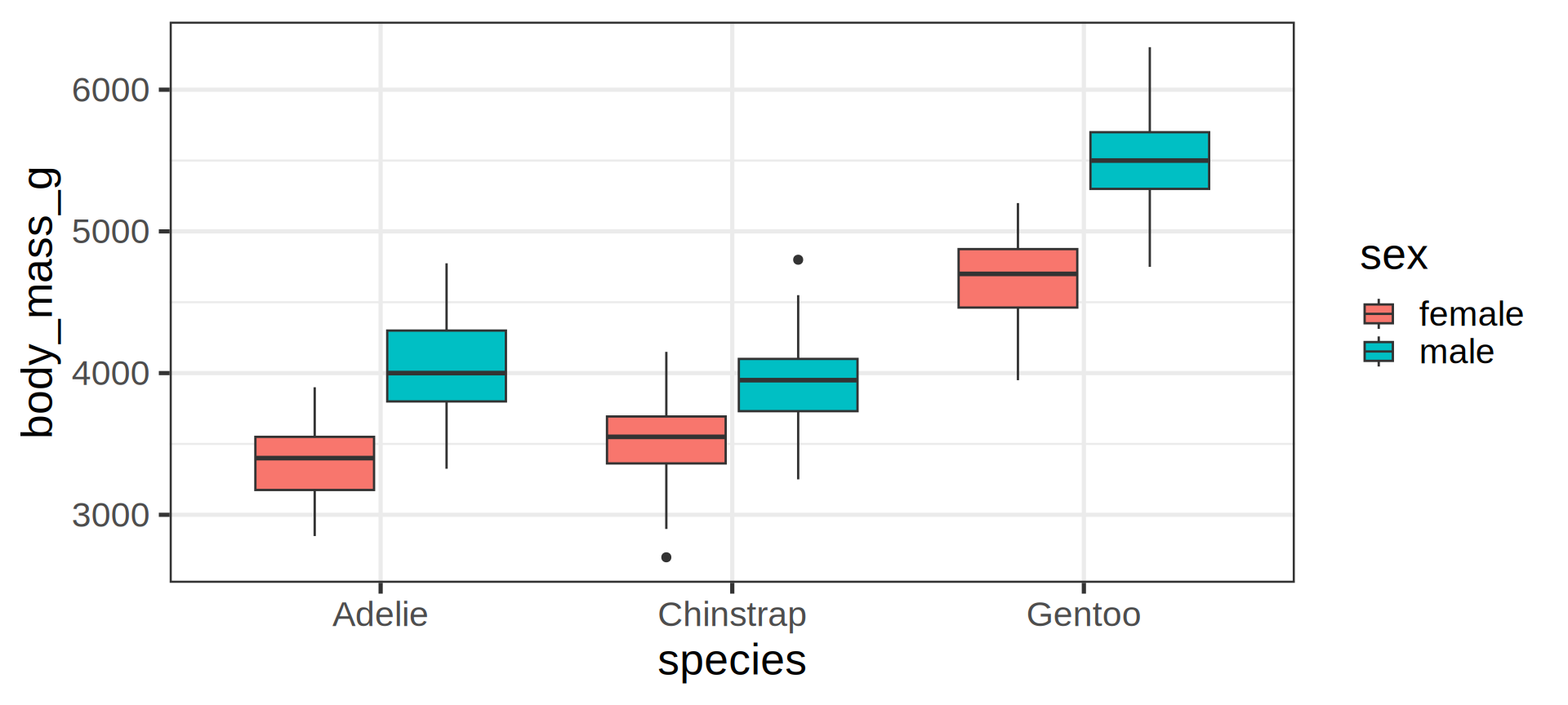
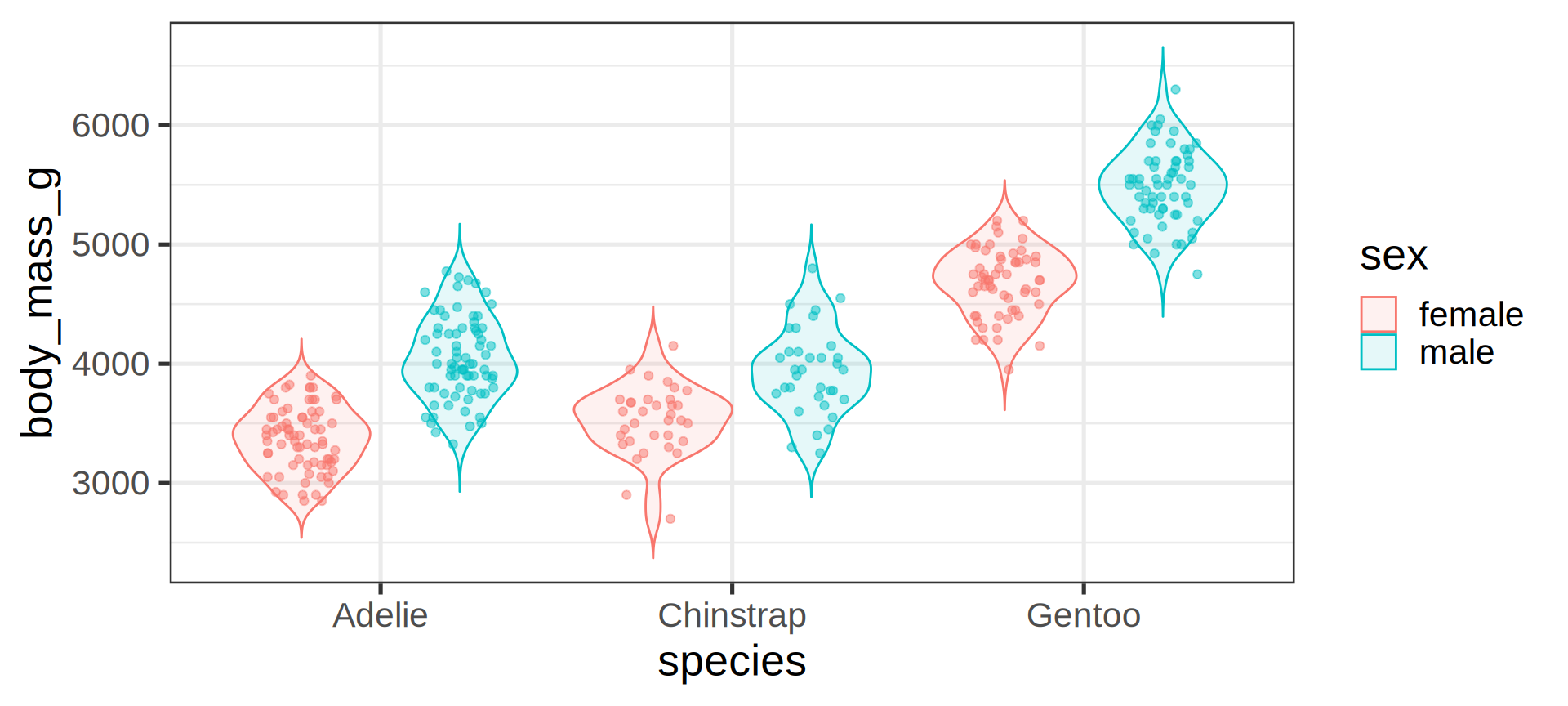
Better: violin and jitter
Show the data
penguins |>
  filter(!is.na(sex)) |>
  # define aes here for both geometries
  ggplot(aes(y = body_mass_g,
             x = species,
             fill = sex,
             # for violin contours and dots
             colour = sex
  )) +        # very transparent filling
  geom_violin(alpha = 0.1, trim = FALSE) +
  geom_point(position = position_jitterdodge(dodge.width = 0.9),
             alpha = 0.5,
             # don't need dots in legend
             show.legend = FALSE)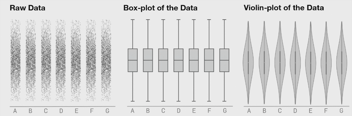
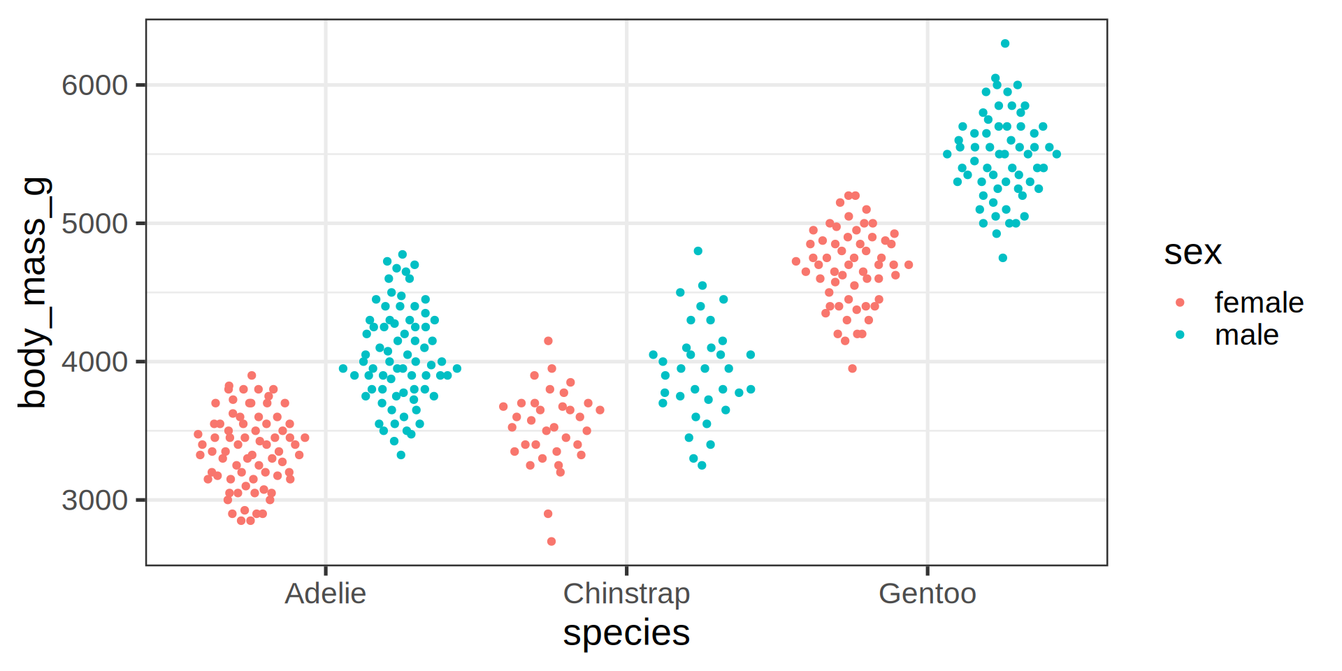
Even better: beeswarm
ggplot extension ggbeeswarm
Coding mistake
What is wrong with the above code?
(Hint: think about inherited aesthetics)
penguins |>
  ggplot() +
  geom_point(aes(x = bill_length_mm,
                 y = body_mass_g)) +
  geom_smooth(method = "lm")
Error in `geom_smooth()`:
! Problem while computing stat.
ℹ Error occurred in the 2nd layer.
Caused by error in `compute_layer()`:
! `stat_smooth()` requires the following missing aesthetics: x and y.Inheritance of aesthetics in main ggplot()
penguins |>
  ggplot(aes(x = bill_length_mm,
             y = body_mass_g)) +
  geom_point() +
  geom_smooth(method = "lm", se = FALSE)
Control the dots plotting order
ggplot2 outputs dots as they appear in the input data
tibble(x = LETTERS[1:3],
       y = x) |>
  ggplot(aes(x, y)) +
  geom_point(aes(colour = x),
             show.legend = FALSE,
             size = 125) +
  scale_color_brewer(palette = "Dark2") +
  theme_classic(20)