Case study - gapminder

Guided tutorial

Roland Krause

R Workshop

Thursday, 13 February 2025

Learning objectives

You will learn

  • Use dplyr / purrr for efficient data manipulation
  • Tidying multiple linear models using broom
  • Managing related things together in one tibble
  • Summarise findings in one ggplot using relevant aesthetics

Guided practical

Interactive session

  • Use the provided template practical06_gapminder.qmd in your rworkshop-practicals-username repo.

Managing multiple models

Tutorial based on the great conference by Hadley Wickham

List-column cheatsheet, reminder

list in a data.frame/tibble

list of tibbles in a data.frame/tibble

Keep all analyses together

Workflow from last time

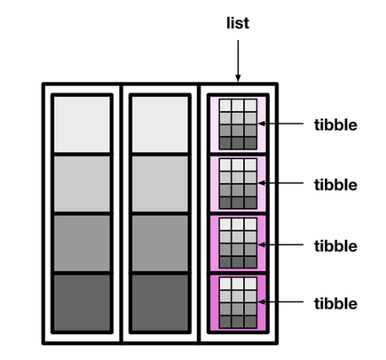
palmerpenguins::penguins |>
  # Nest only the relevant cols (bill measurements)
  # and ID penguins with biology criteria
  nest(data = starts_with("bill"), 
       .by = c(island, species)) |>
  mutate(model = map(data, \(x){ lm(bill_depth_mm ~ bill_length_mm,
                                   data = x) } ),
         summary = map(model, summary),
         r_squared = map_dbl(summary, "r.squared"))
# A tibble: 5 × 6
  island    species   data               model  summary    r_squared
  <fct>     <fct>     <list>             <list> <list>         <dbl>
1 Torgersen Adelie    <tibble [52 × 2]>  <lm>   <smmry.lm>    0.0620
2 Biscoe    Adelie    <tibble [44 × 2]>  <lm>   <smmry.lm>    0.219 
3 Dream     Adelie    <tibble [56 × 2]>  <lm>   <smmry.lm>    0.258 
4 Biscoe    Gentoo    <tibble [124 × 2]> <lm>   <smmry.lm>    0.414 
5 Dream     Chinstrap <tibble [68 × 2]>  <lm>   <smmry.lm>    0.427 

nest(.by = col) is roughly equivalent to:

penguins |>
  group_by(island, species) |>
  summarise(data = list(cur_data())) |>
  rowwise() 

rowwise() ensures that operations are performed on each row

Gapminder

Gapminder is a fact tank

Dataset

Hans Rosling

  • Fundamentally optimistic
  • Great talk

Gapminder colors

Let’s take a look at the Gapminder vignette

Gapminder palette

Gapminder palette

Your turn: Explore Gapminder!

  • Install the gapminder package
  • Load gapminder and tidyverse packages
  • Use the pipe |> to pass gapminder to ggplot()
  • Plot the Life expectancy (lifeExp) on y vs. the year (on x).
  • Use geom_line()

Caution

Mind the grouping!

10:00

Gapminder countries

# install.packages("gapminder")
library(gapminder)
gapminder |>
  ggplot(aes(x = year, y = lifeExp,
             group = country)) + 
  geom_line()

Gapminder with country colors

gapminder |>
  ggplot(aes(x = year, y = lifeExp, colour = country,
             group = country)) + 
  geom_line() +
  scale_color_manual(values = country_colors) +
  theme(legend.position = "none")

One country example: Germany

From original tibble

gapminder |>
  filter(country == "Germany") |>
  select(!c(country, continent))
# A tibble: 12 × 4
    year lifeExp      pop gdpPercap
   <int>   <dbl>    <int>     <dbl>
 1  1952    67.5 69145952     7144.
 2  1957    69.1 71019069    10188.
 3  1962    70.3 73739117    12902.
 4  1967    70.8 76368453    14746.
 5  1972    71   78717088    18016.
 6  1977    72.5 78160773    20513.
 7  1982    73.8 78335266    22032.
 8  1987    74.8 77718298    24639.
 9  1992    76.1 80597764    26505.
10  1997    77.3 82011073    27789.
11  2002    78.7 82350671    30036.
12  2007    79.4 82400996    32170.

Nested tibble

by_country |>
  filter(country == "Germany")
# A tibble: 1 × 3
  continent country data             
  <fct>     <fct>   <list>           
1 Europe    Germany <tibble [12 × 5]>
by_country |>
  filter(country == "Germany") |>
  unnest(data)
# A tibble: 12 × 7
   continent country  year lifeExp      pop
   <fct>     <fct>   <int>   <dbl>    <int>
 1 Europe    Germany  1952    67.5 69145952
 2 Europe    Germany  1957    69.1 71019069
 3 Europe    Germany  1962    70.3 73739117
 4 Europe    Germany  1967    70.8 76368453
 5 Europe    Germany  1972    71   78717088
 6 Europe    Germany  1977    72.5 78160773
 7 Europe    Germany  1982    73.8 78335266
 8 Europe    Germany  1987    74.8 77718298
 9 Europe    Germany  1992    76.1 80597764
10 Europe    Germany  1997    77.3 82011073
11 Europe    Germany  2002    78.7 82350671
12 Europe    Germany  2007    79.4 82400996
# ℹ 2 more variables: gdpPercap <dbl>,
#   year1950 <dbl>

Your turn: Add linear models

  • Using by_country
  • Add a new column model with linear regressions of lifeExp on year1950
  • Save as by_country_lm
10:00

Linear models

Linear model per country

by_country_lm <- by_country |>
  mutate(model = map(data, \(x) lm(lifeExp ~ year1950, 
                                   data = x)))
by_country_lm
# A tibble: 142 × 4
   continent country     data              model 
   <fct>     <fct>       <list>            <list>
 1 Asia      Afghanistan <tibble [12 × 5]> <lm>  
 2 Europe    Albania     <tibble [12 × 5]> <lm>  
 3 Africa    Algeria     <tibble [12 × 5]> <lm>  
 4 Africa    Angola      <tibble [12 × 5]> <lm>  
 5 Americas  Argentina   <tibble [12 × 5]> <lm>  
 6 Oceania   Australia   <tibble [12 × 5]> <lm>  
 7 Europe    Austria     <tibble [12 × 5]> <lm>  
 8 Asia      Bahrain     <tibble [12 × 5]> <lm>  
 9 Asia      Bangladesh  <tibble [12 × 5]> <lm>  
10 Europe    Belgium     <tibble [12 × 5]> <lm>  
# ℹ 132 more rows

Explore a list column, counting

10:00
  • Count the number of rows per country in the data column.
  • Does any country have less data than others?
  • Try writing a single statement that solves this questions!

Note

  • A list column is a list, you need to iterate through elements
  • But remember the tibble is still rowwise grouped (good).
  • distinct() will help to find unique values
  • But remember the tibble is still rowwise grouped (bad).

Explore a list column

by_country |>
  # so n is displayed next to grouped columns
  mutate(n = map_int(data, nrow), .after = continent)
# A tibble: 142 × 4
   continent     n country     data             
   <fct>     <int> <fct>       <list>           
 1 Asia         12 Afghanistan <tibble [12 × 5]>
 2 Europe       12 Albania     <tibble [12 × 5]>
 3 Africa       12 Algeria     <tibble [12 × 5]>
 4 Africa       12 Angola      <tibble [12 × 5]>
 5 Americas     12 Argentina   <tibble [12 × 5]>
 6 Oceania      12 Australia   <tibble [12 × 5]>
 7 Europe       12 Austria     <tibble [12 × 5]>
 8 Asia         12 Bahrain     <tibble [12 × 5]>
 9 Asia         12 Bangladesh  <tibble [12 × 5]>
10 Europe       12 Belgium     <tibble [12 × 5]>
# ℹ 132 more rows
by_country |>
  mutate(n = map_int(data, nrow), .after = continent) |>
  distinct(n)
# A tibble: 1 × 1
      n
  <int>
1    12

Explore a list column, plotting

05:00
  • Plot lifeExp ~ year1950 for Bulgaria by unnesting data

Note

  • filter() for the desired country
  • unnest() raw data
  • Pipe to ggplot()

Explore a list column, plotting

by_country |>
  filter(country == "Bulgaria") |>
  unnest(data) |>
  ggplot(aes(x = year1950, y = lifeExp)) +
  geom_line() 

Explore nested tibble with lm

10:00
  • Display the \(R^2\) for the linear model of Rwanda
  • How do you interpret the \(R^2\) for this particular model?

Warning

  • filter() for the desired country
  • Use map(model, summary) to run summary() on the linear model
  • To extract the named "r.squared", use the map_dbl(summary, "r.squared") (purrr syntax)

Linear model for Rwanda

by_country_lm |>
  filter(country == "Rwanda") |>
  mutate(summary = map(model, summary),
         r2 = map_dbl(summary, "r.squared")) |> 
  select(country, r2)
# A tibble: 1 × 2
  country     r2
  <fct>    <dbl>
1 Rwanda  0.0172
  • \(R^2\) is close to 0, linearity sounds broken
  • broom will cleanup linear model elements into tibbles

Cleanup dirty objects!

Extract nice tibbles from complex objects

Tidying models

15:00
  • Install broom from CRAN
  • Using by_country_lm, add 4 new columns:
    • glance, using the broom function on the model column
    • tidy, using the broom function on the model column
    • augment, using the broom function on the model column
    • rsq from the glance column
  • Save as models
  • Why extracting the \(R^2\) in the main tibble is useful?

Remember

Use map() when dealing with a list column like glance = map(model, glance)

Tidying models

Useful info

  • Coefficients estimates:
    • slope
    • intercept
  • \(R^2\)
  • Residuals
library(broom)
models <- by_country_lm |>
  mutate(glance  = map(model, glance),
         tidy    = map(model, tidy),
         augment = map(model, augment),
         rsq     = map_dbl(glance, "r.squared"))

Extracting \(R^2\) in main tibble

Why? no need to unnest for sorting / filtering

Plotting \(R^2\) for countries

10:00
  • Plot country ~ rsq
  • Color points per continent
  • Reorder country levels by \(R^2\) (rsq): snake plot
  • Which continent shows most of the low \(R^2\) values?

Note

To reorder the discrete values of country:

  • Use the forcats package
  • fct_reorder(country, rsq) to reorder based on the rsq continuous variable

Do linear models fit all countries?

Snake plot

library(forcats)
models |>
  ggplot(aes(x = rsq, 
             y = fct_reorder(country,
                             rsq))) +
  geom_point(aes(colour = continent), 
             alpha = 0.8, size = 3) +
  theme_classic(18) +
  theme(axis.text.y = element_blank(),
        axis.ticks.y = element_blank(),
        legend.position = c(0.25, 0.75)) +
   guides(color = guide_legend(
     override.aes = list(alpha = 1))) +
  labs(x = expression(R^2),
       y = "Country",
       color = "Contient") +
  scale_color_manual(values = continent_colors) 

Display the raw life expectancy for countries with a low \(R^2\)

10:00
  • Focus on non-linear trends from models
  • Filter the 20 countries with the lowest \(R^2\)
  • unnest column data
  • Plot lifeExp ~ year with lines
  • Colour per continent
  • Facet per country
  • Same questions for the top 20 \(R^2\)

Note

  • You must ungroup() as we work currently by row
  • slice_min(col, n = 5) returns the 5 minimal values of col

Interpreting the linear model

Regression

  • What represents the intercept?
    • Using year1950?
    • Using year?
    • Justify Hadley choice
  • What represents the slope?

  • Coefficients with predictor year - 1950
filter(models, country == "Germany") |>
  unnest(tidy) |>
  select(continent, country, estimate)
# A tibble: 2 × 3
  continent country estimate
  <fct>     <fct>      <dbl>
1 Europe    Germany   67.1  
2 Europe    Germany    0.214
  • Compare with model and original years
gapminder |>
  filter(country == "Germany") |>
  # Native placeholder: '_'
  lm(lifeExp ~ year, data = _) |> 
  tidy() |>
  select(term, estimate)
# A tibble: 2 × 2
  term        estimate
  <chr>          <dbl>
1 (Intercept) -350.   
2 year           0.214

Summarise on one plot

  • Unnest coefficients (tidy column)
    • Mind to keep the continent, country and rsq columns
  • Put intercept and slope in their own columns
    • In wide format, only one value can be used.
    • Discard unused columns.
  • Plot slope ~ intercept (watch out the (Intercept) name which needs to be called between backticks ‘`’)
  • Colour per continent
  • Size per \(R^2\) (use for scale_size_area() for readability)
  • Add tendency with geom_smooth(method = "loess")
20:00

The final plot in Gapminder colors

gapminder |>
  mutate(year1950 = year - 1950) |>
  nest_by(continent, country) |>
  mutate(model = list(lm(lifeExp ~ year1950,
                         data = data)),
         glance  = list(glance(model)),
         tidy    = list(tidy(model)),
         rsq     = pluck(glance, "r.squared")) |> 
  unnest(tidy) |>
  select(continent, country, rsq, term, estimate) |>
  pivot_wider(names_from = term,
              values_from = estimate) |>
  ggplot(aes(x = `(Intercept)`, y = year1950)) +
  geom_point(aes(colour = continent,
                 size = rsq)) +
  geom_smooth(se = FALSE,
              method = "loess",
              formula = "y ~ x") +
  scale_size_area() +
  labs(title = "Development of Life Expectancy",
    x = "Life expectancy (1950)",
       y = "Yearly improvement",
       colour = "Continent") +
  scale_colour_manual(values = continent_colors) 

Animation with gganimate

library(gganimate)
gapminder |>
  ggplot(aes(x = gdpPercap,
             y = lifeExp,
             size = pop, 
             color = continent)) +
  transition_time(year) +
  ease_aes("linear") +
  scale_size(range = c(2, 12)) +
  geom_point() +
  theme_bw(16) +
  labs(title = "Year: {frame_time}", 
       x = "GDP per capita", 
       y = "Life expectancy") +
  scale_x_log10() -> p
animate(p)
anim_save("gapminder.gif")

Takes ~ 2 minutes due to easing

Before we stop

You learned to

  • Keep related things together:
    • Input data
    • Meaningful grouping ids
    • Perform modelling
    • Extract relevant model components
    • Explore visually your findings

Acknowledgments

  • Hadley Wickham
  • Jennifer Bryan
  • David Robinson
  • Thomas Pedersen

Contributions

  • Eric Koncina
  • Aurélien Ginolhac

Thank you for your attention!